


nami is a bit pale and the render looks weird the font shadow is questionable too.
if sona is on the first layer u might as well drop the border of that sig, her hand and cloth being cut of irritates me~
but quite nice work if you are just starting out!
if sona is on the first layer u might as well drop the border of that sig, her hand and cloth being cut of irritates me~
but quite nice work if you are just starting out!
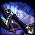
~ Sig by Xiaowiriamu ~


RuNBlacK wrote:
I took a request from another thread and made a sig. I'd like some constructive criticism, if you don't like it then tell me why. If you DO like it tell me why.

I really like the background, but as Janjan said, brightening Jinx herself will match better. Also, in the second one, try erasing the overlay line on top of Jinx :) It'll give it a nice 3D effect.
jamespongebob wrote:
practicing making signatures/banners... thoughts?
They're quite big for signatures. Try 500x150 or 500x175 (I use this size). Nami is a bit too pale, and fits in almost too well with the background. You want renders to match so it doesn't look out of place, but you also want the render to have some sort of emphasis on them so that they're the focal point.
The Sona one looks nice, but as koksei said, put the border on the very top. Right now, it looks kinda like an incomplete pop out.
Also, the text imo should be lowered a bit. It's floating kinda awkwardly next to the left side. I would either just put it in the corner (same distance from left border and bottom, if hat makes sense) or make it float completely just to the left of Sona's hair.

Took you guys advice, came out pretty nice. I find it really hard to use real people in sigs and make it seem like they weren't just placed on the background.
Was playing around a bit and saw this matched her paleness.
Was playing around a bit and saw this matched her paleness.


are you using photoshop? if so I would want to try to see what I can do with a few layers and stuff.
So if you'd be kind enough to provide .psd file so I could try :) (I am thinking about cooling filter, some curve play and brightness layer)
So if you'd be kind enough to provide .psd file so I could try :) (I am thinking about cooling filter, some curve play and brightness layer)
I made some super quick changes by decreasing opacity on one layer and adding cooling filter and a brightness/contrast layer.
EDIT: And to make it blend more you can just add another brightness layer and make a clipping mask to the background layer(s)


You need to log in before commenting.
<Moderator>