


I think the blendy step with the fire stock is pretty necessary. But I like the 3D effect you've got going there, Jeffy.
Xiao: I did give it a go, but I couldn't really blend the background into the render part. I'll upload it later today after university.
Xiao: I did give it a go, but I couldn't really blend the background into the render part. I'll upload it later today after university.
Tweaked the colour scheme for a little more of a purple/red colour, but otherwise I felt the original colour was nicer than adding a prominent gradient :3
Thanks for the constructive feedback :) I only just noticed that the render seemed blurry. I normally have a thin border, but felt it didn't look good, mainly because there was nothing on the left hand side, and I thought the border added something there :3
Text looked terrible no matter what I did. I may play around with it a little more, but I do see why a prominent gradient can make things "mesh" more.
Text looked terrible no matter what I did. I may play around with it a little more, but I do see why a prominent gradient can make things "mesh" more.
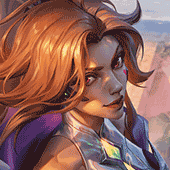
Jovy
<Admin>
<Admin>
Weeeeeeeeeeeeell I tried :p
Version 2:

version 1 was a bit eh.. dark for my liking so i added some more color and light c:
edit;
Version 3
I like version three best :3 I made the border dark, which looks better in my opinion.. I also had to redo the light and stuff from version2 so it's not as bright
Version 2:
version 1 was a bit eh.. dark for my liking so i added some more color and light c:
edit;
Version 3
I like version three best :3 I made the border dark, which looks better in my opinion.. I also had to redo the light and stuff from version2 so it's not as bright
by jhoijhoi
See you can do it! :)
Nice outcome MissMaw! Version 3 is best as well in my opinion.
Nice splatter brushes. I'd suggest to help improve your image is to use rule of thirds (rule of 3) to get focal points perfect, and also descaling the brush sizes and also try get a few splatters over render more (see my outcome for what i mean)
Other-than that, really nice, you got the background nicely done, text is pretty exciting, and also you've sharpened and blurred areas nicely, i wouldn't blur too much of the background though, my eyes keep trailing from the splatter to the mirrors edge render :D
hope this helps,
Thanks for trying out my tutorial, much appreciated (everyone)
You need to log in before commenting.
WOOT gonna give it a try
:D! gogo~
^_^!!
Thanks, and it's not that complicated! You can do it :)
Hah, yeah original color scheme was more appealing, but the gradient helped smooth and color coordinate the overall image :D also thanks and please do have a go :)
Nice attempt! you certainly grasped the background and text. Looks amazing, your smudging and liquefying is really good. I would suggest however using different splatter brushes, and trying to splatter more around the image, not just the render :) Also experiment with layer adjustments, a lot of people seem to ignore doing it - It can sometimes boost your images' potential and outlook
i'll recommend these splatters:
http://qbrushes.net/photoshop-splash-brushes/2nd-splatter-brush/