


Nyoike
<Member>
<Member>


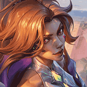
Ny: I like the high contrast of the image and the background, but I really dislike the text. It's probably fine placement (maybe the other side of the sword would be better?), but the font choice doesn't fit with the style. Nor does the mono-tone colour. Have you tried using clipping masks?
GrandmasterD wrote:
Looks really nice Nyoike. Although the text is kinda, well 'hidden', if you know what I mean. I love the bright cartoonish colours.
Just post it again then...
Jovy
<Admin>
<Admin>
Nyoike
<Member>
<Member>
jhoijhoi wrote:
Ny: I like the high contrast of the image and the background, but I really dislike the text. It's probably fine placement (maybe the other side of the sword would be better?), but the font choice doesn't fit with the style. Nor does the mono-tone colour. Have you tried using clipping masks?
I tried Clipping Masks before, but when I try to choose where to take it from, it is normally either too hidden or too prominent. And for font I really don't have much that fits styles, normally just heavy font will fit sigs if blended properly IMO. As for placement I was going with Rule of 3rds, generally looks better when focal points and important things go along with the rule of 3rds.
GrandmasterD wrote:
Just post it again then...
I saw yours but I was hoping for more than just 1 person's CnC. I find the text easy to find, when I look at Tryn I follow the flow of his hair and then BAM I see the text.
Quoted:
what gmd said, you could add a small border (stroke, is it?) around the text
That is a stroke, and I could try it, but a general rule of thumb is that strokes are bad for text.
To be updated soon!
Additionally, I think the text should be the other way - like:
N
Y
O
I
K
E
Try a clipping mask or a lighter colour, get rid of the drop shadow and set the opacity lower. Also, change the font to something swirly. You've got a block font when the image is all about flow and smooth lines.
I've found through experimentation that drop shadows are normally all bad on most signatures.
Quick example (though if the text is this way, a block text would work):


So uh, made this for my friend the other day... Ik her name is just silly xD But I made her this banner... Can I get some feedback?
Oh yeah, here is the link to her stories btw if anyone is interested
http://friskykittystories.tripod.com/
Oh yeah, here is the link to her stories btw if anyone is interested
http://friskykittystories.tripod.com/
Nyoike
<Member>
<Member>
jhoijhoi wrote:
Additionally, I think the text should be the other way - like:
N
Y
O
I
K
E
Try a clipping mask or a lighter colour, get rid of the drop shadow and set the opacity lower. Also, change the font to something swirly. You've got a block font when the image is all about flow and smooth lines.
I've found through experimentation that drop shadows are normally all bad on most signatures.
Quick example (though if the text is this way, a block text would work):
Better?
The problem I have with text like that is that you cannot fit as much. I decided to go with just "nyo", I tried clipping mask and stroke, and it works, but it's 2 ways I was told to never put text on sigs. As for fonts, I really don't have much in the line that would fit this, I went for one that I thought kind of did.
To be updated soon!
You need to log in before commenting.
<MOBAFire Mother>
♡ sig by Jovy ♡