


Sk1llbug
<Member>
<Member>
This made me think about what I've done with my art. I don't even fulfill half of those guidelines yet... It will really help me improve what I do from here on. Thanx :D
Thanks to ALOT OF PEOPLE for all the awesome signatures!
If I helped, don't hesitate to +Rep :D


nervouspuny
<Member>
<Member>
"Every work of art has two aspects. It is this experience that you can admire and enjoy, and is also a record of the past. The art is valued, preserved and studied by both identities. As current experience, the works of We pay art of pleasure, tension, drama, and ultimately, the satisfaction of simply enjoy being a work of art. "
There are so many. Some are common to all the arts, and some are specific to the form. In general terms, perhaps - a concept or theme, composition (a through space for painting and sculpture, and how over time with the music), color and expression (with the tonal range of the paint and music). Some art forms characteristic of their culture depends fully recognized, but some features such as concept, composition and the expression seems that communication between different cultures (eg, Westerners can appreciate Japanese, or Australian aboriginal art). It is a vast field for observation, thought and practice! What a joy!
...........submit infographics..........


btw vulcan isn't me LOL
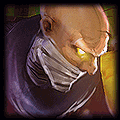
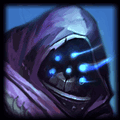
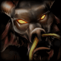
Thanks to TRUeLM, Plastictree, Scrax, Xiaowiriamu, foggy12, JahGFX, jhoijhoi, msrobinson, JEFFY40HANDS, Nyoike, MissMaw, and me :) for the sigs!

Infraynor
<Member>
<Member>
Elleeeeeka
<Member>
<Member>


Sk1llbug wrote:
This made me think about what I've done with my art. I don't even fulfill half of those guidelines yet... It will really help me improve what I do from here on. Thanx :D
I got tuts in my comment that help with many of those guidelines, you can call me megaboss!
You need to log in before commenting.
Guidelines on the Aspects of Art:
1. Focal
Without a focal, you would basically be looking at an image with yours eyes just wandering around. The focal point in a piece of art is the point in which all directions of the piece lead you to. Usually the focal is some sort of render or photo that is always clear and distinct.
2. Flow
Flow is that way in which the piece of art draws your eyes across it. Flow is created by using effects to drag your eyes from a starting point, to an ending point. The ending point should always be where your focal is located.
3. Blending
Blending is what makes your focal blend in with the background that you have created. Blending can be achieved with many different techniques, find one that fits you and go with it. Shadows are a step to blending that many leave out, when you place a render on a random background you must place some kind of shadow (that goes with the lighting) in order for it to seem as if that render really is on that background. Other techniques to blend are things such as smudging, duplicating layers and changing the layer settings, and many other things.
4. Depth
Depth is the perspective that your artwork gives off. It creates a 3D feeling to your art that will not only make it look better, but it will also bring out your focal. Depth can be achieved in numerous different ways, some of which are blurring, darkening, and burning.
5. Lighting
Lighting will better define and blend your focal. Lighting is normally already set on your focal, and therefore the lighting of your artwork as a whole must follow the lighting of that focal. Remember to create a light source that looks realistic and isn't simply a white soft brush at 100px.
6. Cleanliness
Keep artwork simple. while your concepts can be complex, keep the effects simple. Cluttered artwork looks chaotic and ruins flow.
7. Text
First, remember that all artwork DOES NOT need text. One tip for keeping text looking good is avoid corners. Also to remember to keep text readable, fancy fonts may look cool, but they can kill any piece of artwork. Also remember that there are many different things you can do with text besides changing the font. You can change the color, size, direction, spacing, and many other things on fonts that will give them a cool, readable characteristic.
Guidelines to Providing Criticism:
1. How to Reply
Dont reply with terms such as "It sucks" or even "Awesome!" - This doesn't provide the artist with any ideas on how to improve their artwork. Saying things like "It sucks" looks negatively upon our community and keeps members from posting more of their art. Remember to always tell them everything you think they can improve on, but do so in an encouraging way.
2. How to Rate
Don't rate art if you don't know what you're doing. Rating artwork poorly can look negatively upon our community. This doesn't mean you can't give a signature a 1/10 because it simply isn't good artistically, this means don't rate artwork 1/10 because you don't like the character who's in it, you don't like the artist or anything along those lines. Rate on what the art truly deserves, or don't rate at all. When you rate a piece of art, ALWAYS give a reason why you rated the art how you did. Simply rating 10/10 is both spam and non constructive for the artist trying to learn.