


Commented
Posted a Comment: Dec 5th, 2011
"I woulda voted yours if I wasn't reserving my votes incase of ties."
Commented
Posted a Comment: Dec 4th, 2011
"Not because it doesn't fit my style it's because it ruins sigs."
Commented
Posted a Comment: Dec 4th, 2011
"Not because it doesn't fit my style it's because it ruins sigs."
Commented
Posted a Comment: Dec 4th, 2011
"Drop the text and borders.
It's really messy, the focal is too blurry there's no sense of depth or lighting at all.
Your ali one was sooo much better. :/"
Commented
Posted a Comment: Dec 4th, 2011
"I didn't use any C4Ds. :/ Only smudging and 1 light effect!"
Commented
Posted a Comment: Dec 4th, 2011
"pazlm, you got same problem as me, your light is waaay too strong. :/"
Commented
Posted a Comment: Dec 4th, 2011
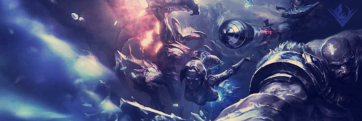
"Using the chinese art, cba to render this one, if you don't like it i will redo it. :)
no text
"
Commented
Posted a Comment: Dec 3rd, 2011
"Go look in mrbunnyslippers thread i put text in it there, but i don't care about text too much it fucks up sigs imo. Also used no c4ds just smudge and 1 light effect."
Commented
Posted a Comment: Dec 3rd, 2011
"Tried a smudge sig, in a diff style to others I see! Whatya think?
"
Commented
Posted a Comment: Dec 3rd, 2011
"Tried a new style. :D
Smudging!
"