


Commented
Posted a Comment: Dec 18th, 2011
"You have to give at least an image that you would like to have, what text do you want.... and, just my personal opinion, but I reckon that a PLEASE would help as well. "
Commented
Posted a Comment: Dec 18th, 2011
"It´s over saturated. You can´t really tell what is on the image. That font with stroke and effects in high opacity looks horrible. Try to make things clearer, cause otherwise it looks like a completely mess. "
Commented
Posted a Comment: Dec 17th, 2011
"
Lol.
What is LQ?(English is not my mother language sorry). Actually I added a gradient map with warm tones, but I guess color changes a lot depending of the screen where you see the imag"
Thread
Created a Thread In Artist's Corner On: Dec 16th, 2011
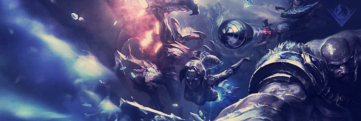
Wukong Sig
There you are. Feedback is welcome!!
Commented
Commented
Commented
Posted a Comment: Dec 16th, 2011
"
Yeah, the bottom is gonna be filled with text about the event that I'm preparing. "
Thread
Created a Thread In Artist's Corner On: Dec 16th, 2011
Wukong poster
Well, same as the kasadin one, this one if for a brochure as well, so the bottom is gonna be filled with another box, that´s why there´s no work. I was trying some things, and i was never really...
Commented
Posted a Comment: Dec 16th, 2011
"All the feedback is welcome. And all the opinions are respected.
I agree that some parts of the image are over sharpened. Also, in my defense I will say that the image quality is in 50%, cause it was too heavy....ah, and it´s not just a couple of brushes...xD.
Thanks for the feedback. "