


Commented
Posted a Comment: Dec 16th, 2011
"Really good sign. Although I don't like that much the illumination in the bottom of the render, looks like it was cut. The images in the sides are just perfect. I would try to add maybe a curves and levels mask to play a little bit more with midtones and shadows.
Overall, a really good sign mate.
"
Commented
Thread
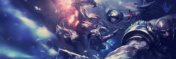
Created a Thread In Artist's Corner On: Dec 15th, 2011
Kasadin Poster. My presentation
Well, I introduced myself in another post, so now it´s time to show my work.
I´ve done this artwork for a brochure that I have to design for an assessment that I´m doing about an event. The...
Thread
Created a Thread In Artist's Corner On: Dec 14th, 2011
Newbie here
Hi there.
I´m new in this forum, but I´ve been in many others about graphic design, signatures and stuff like that. If someone can give me a good tip and explanation in general terms about this...