


LalaSama
<Member>
<Member>
LalaSama
<Member>
<Member>
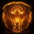
So here is the Introduction chapter header, tell me if you like it!
Redoing the main banner thing because it doesn't fit the way I made the chapter...

Give me an okay on the intro one and I'll make the other ones right away :)
Redoing the main banner thing because it doesn't fit the way I made the chapter...
Give me an okay on the intro one and I'll make the other ones right away :)
Keep an eye out for my soon to be published guides ;)
LalaSama
<Member>
<Member>
And here's two line dividers
I hope they are the right size cause honestly I have no idea how big they are supposed to be ._.
I made one with some text Idunno if it will look good in your guide but eh, and the other is just a simple red line in about the color you requested.
I can make them longer if needed so just tell me.
I hope they are the right size cause honestly I have no idea how big they are supposed to be ._.
I made one with some text Idunno if it will look good in your guide but eh, and the other is just a simple red line in about the color you requested.
I can make them longer if needed so just tell me.
Keep an eye out for my soon to be published guides ;)
LalaSama
<Member>
<Member>


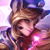
Lala, if you're going to have the theme of the photo pink, you have to make the text go along with it.
Set the text to underlay so it becomes pink too.
The red text just looks too weird and stands out way too much.
As a side note, Fiora definitely does not go well with pink.
If you DO want to use pink though, I'd run with a pink background, but keep the render clean. Use the eraser to wipe the pink off Fiora.
That'll definitely make a difference.
LalaSama
<Member>
<Member>
I don't know, I'm very bad at judging my own artwork and I always think it's **** no matter how good it looks.
I asked my boyfriend for advise and he said it looked good like this and eh...
Anyways, does this look better?
I asked my boyfriend for advise and he said it looked good like this and eh...
Anyways, does this look better?
Keep an eye out for my soon to be published guides ;)
Yes, that looks much better.
However, going back to the overlay and clearing factor.
Whatever you do to the top layer, do it to the text.
SO the text should not be bright red, it should be faded like the rest.
Take the rubber tool and clean the darkness off of Fiora.
Clean the face, her cleavage, her hair and her arms. This'll make her really pop and stand out.
BTW, are you using gimp or photoshop?
EDIT:
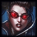
Here is an example of cleaning up the face. This is a shen banner I made for Bligen himself.
See how I can make the pink work by making Shen stand out? I don't make him pink, I make the background pink.
Keep the focus clean, do not taint them the same as the background. They are the "focal point" for a reason.
However, going back to the overlay and clearing factor.
Whatever you do to the top layer, do it to the text.
SO the text should not be bright red, it should be faded like the rest.
Take the rubber tool and clean the darkness off of Fiora.
Clean the face, her cleavage, her hair and her arms. This'll make her really pop and stand out.
BTW, are you using gimp or photoshop?
EDIT:
Here is an example of cleaning up the face. This is a shen banner I made for Bligen himself.
See how I can make the pink work by making Shen stand out? I don't make him pink, I make the background pink.
Keep the focus clean, do not taint them the same as the background. They are the "focal point" for a reason.


97BligenN wrote:
So I'm making a top lane fiora guide, and wanted to get an artist working on the images already, since I'm asuming it would take a while aswell.
- The order:: A banner and 10chapter icons with the image this
- The banner: Somewhere in the middle "Fiora - The Grand Duelist" and below it in a smaller font "By 97BligenN"
- The chapters: Introduction ; Pros & Cons ; Masteries ; Runes ; Summoner Spells ; Abilities ; Items ; Gameplay ; Matchups ; Summary
- Sizes: banner arround 800x350 and each chapters 800x150.
- Details: A font the upper one and a color: this would be best (In the forum the code is #A60000)
- Aditional orders: A signature same image, same text as banner just sized 500x150 or so
- Another aditional order: A line divider, something of this color would be nice, if possible arround the same width as this thingey below:
So yeah if you can make this all please inform me about it, will pay back with +rep and a shoutout to you next time I eat a cookie!
EDIT: Also if possible a "Back to the Top" button, something quite small, but if possible so it could fit the theme. Ty (Shoutout when I drink coco?)
So I tried to make watcha asked for the best I could. The thing with the font you wanted, too much of it made it look bad and was hard to read. So that's why I mixed fonts. If that doesn't work for ya let me know and I can try again though. I'm also going to post your sig on my forum, just so others have another example of my work. But anyways, here ya go: :)
Link to the album.
Your sig:

Banner:(Two versions cuz I know you asked for the text to be centered, but I feel it looks better balanced on top. Your choice though of course.)
(VER1)

(VER2)

Now that I see it again idk, it might be better centered. Lol w/e your pick XD
Oh and the chapter headers are in an album in that link (So is the button and the red divider). I'd post em here but there's A LOT o_OO

You need to log in before commenting.
I have time now though :3
I'll be going to sleep soon since it's 4:30 for me now but I'll work on the banners tomorrow and most likely have them done.