Commented
Posted a Comment: Feb 21st, 2012
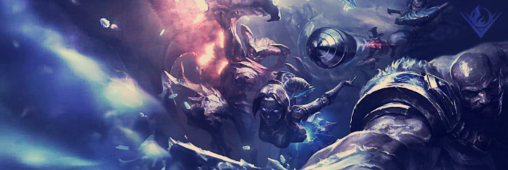
"Need some CnC, put quite a bit of time into this, have 2 main versions and another one that I monkeyed with the lighting on. Overall I like it, except for the text... I had no good font to use at the moment and can't find one, so a placeholder font is all ATM.
http://i.imgur.com/LUamq.png"
Commented
Posted a Comment: Feb 20th, 2012
"interesting, very well done, my only problem is my focus gets taken all over the place by sudden contrasts in things:
The 3 bars of difference scenes
The dark bar in the text box
the text box overlapping the render with a fairly noticeable color difference
Other than that looks great. Overall,"
Commented
Posted a Comment: Feb 20th, 2012
"yeah, but it shows the creative flow, or something like that >.>"
Commented
Posted a Comment: Feb 20th, 2012
"Due to a way different weekend, I forgot about this >.<
I'll update the OP ASAP."
Commented
Posted a Comment: Feb 16th, 2012
"And I entered with a collaboration with SchizoFrancis!
Not the best ofc, but we're pleased with it considering it was completely thrown together in one day.
If I had to critique it myself, main thing is that some of it is very cartoony and some of i"
Commented
Posted a Comment: Feb 13th, 2012
"Holy Grunge o.o
Me gusta"
Commented
Posted a Comment: Feb 12th, 2012
"http://kaiokhen.imgur.com/Z6SB6
That's the one I'd always gone to for updates on CHN art, but it hasn't been updated in a while."
Commented
Posted a Comment: Feb 12th, 2012
"oh shit, mixed up my left and right >.< I meant top left, but I'm not sure that would work blended in... But I do like it more with the top right corner blended in I think. tough choice.
"
Commented
Posted a Comment: Feb 12th, 2012
"I thought about that too. But IMO I hate something sticking out like that unless it is the focus if the render. You should post a copy of it with my thought in. I'm curious to see."


