


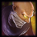


Text is too blurry to read. At first glance looks like "H***exNo"/"Singod Playe"
The partice effects on the saw blade are nice but overly bright. Same with the top of Singed's "water bottle" back pack.
The eye glow is too prominent as well. Too bright and somewhat distracting from the WHOLE image.
I'd suggest re-sizing the text and possibly creating a duplicate layer with either "Overlay" or "Multiply" blend modes applied....
What editing program are you using? Photoshop? GIMP? Other?
EDIT: But overall I like the concept and your color choices are solid. If you can create more contrast in the image though, I think it might break it up a bit. Allow the flow to be a bit smoother rather than just gushing out at you, if that makes sense.
Symphunny
<Member>
<Member>

You need to log in before commenting.
http://www.fearlessgamer.com/wp-content/gallery/champ-splash/chemicalman_splash_2.jpg
With my modifications: