


Views: 1302 *New* Sig Style
|
Report
Hello guys! This is my first blog at MobaFire :3
*nervous nervous*
I owned a Signature Shop, and just now I tried a new signature style for my future requests!
The theme is simple, yet it isn't too empty (What am I talking O-O). For this style, most signatures I make will have scan lines in it, because I feel that scan lines make the signatures stand out more, even if it looks simple.
I will also use soft/smooth-looking background and colours on the signature to *emphasize* on the simplistic style.
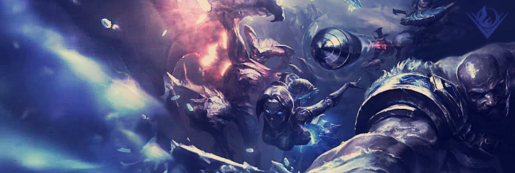
I made one banner with this style:

The white shadow or whatever behind the character seems out of place/weird to me, as it doesn't really fit in that angle. I tried shifting it around, but well I think that's the most suitable place for it to be fitted at.
The text is also white with soft gradient borders, so it will fit in the theme better. I suppose most signatures I make in this style will have a similar text style too ;u;
*nervous nervous*
I owned a Signature Shop, and just now I tried a new signature style for my future requests!
The theme is simple, yet it isn't too empty (What am I talking O-O). For this style, most signatures I make will have scan lines in it, because I feel that scan lines make the signatures stand out more, even if it looks simple.
I will also use soft/smooth-looking background and colours on the signature to *emphasize* on the simplistic style.
I made one banner with this style:
The white shadow or whatever behind the character seems out of place/weird to me, as it doesn't really fit in that angle. I tried shifting it around, but well I think that's the most suitable place for it to be fitted at.
The text is also white with soft gradient borders, so it will fit in the theme better. I suppose most signatures I make in this style will have a similar text style too ;u;
♥ Criticisms are much appreciated! ♥
Thank you :)
Yeah, but the scan lines are in one image (idk how to explain) which is already faded out, because of the border the scan lines seem to stand out more.
Mind sending me your photoshop file?
I love the simplicity of the image. but I do have to agree with Emikadon, either remove the scan lines or fade them out like the rest of them
Thank you :)
Yeah, but the scan lines are in one image (idk how to explain) which is already faded out, because of the border the scan lines seem to stand out more.
looks good
Thank you!
I would recommend removing the scan lines from the border :)
I find it annoying too xD I'm still trying to get a new scan lines thing, cause the scan lines I use now is the pattern.