


Nyoike
<Member>
<Member>

Infraynor
<Member>
<Member>
Nyoike
<Member>
<Member>
Imagine it on a shirt... what the hell do you think I've been doing?
It would look very nice on a black shirt, unless you are too stupid to realize that the black background is just there to show the picture properly. It's not gonna be there in the final product. I'm not gonna have a white t-shirt with a big black box in the middle of it.
On a black t-shirt it looks exactly how I think it should look. And typography is the blaze eh? IDC, I'm doing this for what my friends and I want, not what is "the blaze".
We like this, but think it could use improvements on it. Minor improvements, not completely redesigning the whole thing.
So either help improve the text part or GTFO.
And I've not seen much good text stuff from you, you always leave your sigs without text...
To be updated soon!


hmmm maybe try 2D text with a drop shadow directly behind it (not offset at all)?
might just be me, but I don't like the bevel that much.
might just be me, but I don't like the bevel that much.
Infraynor
<Member>
<Member>
Nyoike
<Member>
<Member>
I made everything, except for the font, that's freeware and legal for use.
@Nameless, I would but there isn't a drop shadow feature in PSE8, I had to improvise it myself.
The "bevel" is actually a 2nd copy of the text that is supposed to be the shadow.
@Nameless, I would but there isn't a drop shadow feature in PSE8, I had to improvise it myself.
The "bevel" is actually a 2nd copy of the text that is supposed to be the shadow.
To be updated soon!
Nyoike
<Member>
<Member>
Sk1llbug
<Member>
<Member>
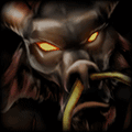
I was thinking that maybe you could shape the background like an eagle (or whatever animal that is XD).
Something like this? Just an example, but you get the idea:

Something like this? Just an example, but you get the idea:
Thanks to ALOT OF PEOPLE for all the awesome signatures!
If I helped, don't hesitate to +Rep :D
You need to log in before commenting.
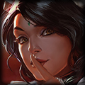
As of the moment, the background is my personal preference and one of my friends does like, but thinks there could be improvement.
What I want help with most is text.
What should I do with it!?
tl;dr - What can I do to improve this, esp. the text part?
Will update this post with possible changes and things to try, mostly so I do not forget them.
TO DO/TRY:
TTTTTTTTTTTTTTTTTTTTTTTTTTTTT