


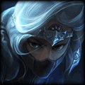


The depth looks really really messed up..
The text, and the square around the text is not good at all. Look at my text tutorial, please please! I think it might help!
The coloring is alright could be better though.
The lighting is alright except the white soft brush over his head, could be better, maybe make it bigger and have half of it inside and outside the sig if u get what I mean. If not you can ask me to make I picture, its no biggy for me, I would do that. (Even then I dont think that its a good spot to put the lighting for this specific sig, I think u have something overlay on the background like a gradient map, and then this softlight softbrush white, I can tell, if so, that creates a disruption.
The flow is good.
The gradient maps you use are way to overused, its easy to tell, lower the opacity on them(if there is more then one, which it does seem like it).
Also, the render sucks! I would write more but I g2g to bed, 1 more thing...
The V thing, Red Blue and Yellow looks terrible, taking that out would make the overall sig better.


Nyoike
<Member>
<Member>

JEFFY40HANDS wrote:
Ramen thinks he's a boss. Pay no mind to him.
I like it, but the lighting on the face is a bit too heavy
110% seconded.
To be updated soon!

Baloo
<Member>
<Member>

The color scheme is nicely done, although you need to blend him in a bit better, especially the left side of his head. It looks pretty bad there it just looks obviously cut out. You have a lot right here, you are just missing some key things to have a great sig.
The text might as well be taken out because I honestly couldn't even notice it, so it needs a bit of work there.
Also your lighting is a bit off according to his left arm there, your light should be towards the right side of the sig a lot more. Rather than directly in front of his face.
The text might as well be taken out because I honestly couldn't even notice it, so it needs a bit of work there.
Also your lighting is a bit off according to his left arm there, your light should be towards the right side of the sig a lot more. Rather than directly in front of his face.


RamenL wrote:
The depth looks really really messed up..
no its not.
The text, and the square around the text is not good at all. Look at my text tutorial, please please! I think it might help!
the text is really good. the square around the text is effective and well thought-out. The only issue i'm having with it is the clipping mask could be improved as at the moment it is taking up some focus and attention for viewers. Also its slightly overly sharpened? think to fix this issue is to sharpen the render or slightly blur the text a little bit, maybe 0.2 Gaussian blur.
The coloring is alright could be better though.
I agree to a certain extent, possible a gradient layer to help adjust the overall color balance and color scheme. Other-than this it seems spot on.
The lighting is alright except the white soft brush over his head, could be better, maybe make it bigger and have half of it inside and outside the sig if u get what I mean. If not you can ask me to make I picture, its no biggy for me, I would do that. (Even then I dont think that its a good spot to put the lighting for this specific sig, I think u have something overlay on the background like a gradient map, and then this softlight softbrush white, I can tell, if so, that creates a disruption.
Lighting is the only criticism i have, so i agree with this about the white soft brush, and also about making it bigger (possible 150px~250px at lower opacity) - or just use filter> lighting effects.
The flow is good.
Agreed
The gradient maps you use are way to overused, its easy to tell, lower the opacity on them(if there is more then one, which it does seem like it).
??????????
Also, the render sucks! I would write more but I g2g to bed, 1 more thing...
your opinion is void.
The V thing, Red Blue and Yellow looks terrible, taking that out would make the overall sig better.
Your opinion again, and you dont justify....why to take it out. how will it make it better? to be fair any good artist will probably say that the red blue and yellow actually brings an edge towards the signature.
Additional comments:
- Really love the fact you made the render much darker in comparison to your overall color scheme, definitely does create that extra focus and also fits nicely with the background (by this i mean the left side where the color goes from an orangery-red to purple )
- I know how it feels to come back from a long break and do a signature, especially if its a year! you feel like you've just begun at stage 1 again...so good outcome for such inactivity.
- Maybe try experimenting putting a stroke around the render, maybe the color of either red/blue/yellow so it sort of flows well with the background and stands out more.
You need to log in before commenting.
plz rate and CNC!!!!!!!