


What program do you use? Photoshop?
Anyway, all three sigs have these empty black spots that don't look nice.
The texts are too big and too away from the focals of the sigs.
The first one is nice, I don't like the black spots, and I don't like the text placement and color.
The second one is oversaturated and it's really dark. The text is badly placed and the color doesn't match the rest of the sig.
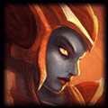
The third one has nicer text in terms of color- well the 'themcdanee' part of the text anyway, the grey text under it isn't really fitting. The text is too big compared to Akali and it's too far away from her. I also don't like the red swirly thing around her, especially not on hr face :P
In the future it might be easier to just post all of your signatures in Mobaverse asking for CnC than making a new thread each time :)
Anyway, all three sigs have these empty black spots that don't look nice.
The texts are too big and too away from the focals of the sigs.
The first one is nice, I don't like the black spots, and I don't like the text placement and color.
The second one is oversaturated and it's really dark. The text is badly placed and the color doesn't match the rest of the sig.
The third one has nicer text in terms of color- well the 'themcdanee' part of the text anyway, the grey text under it isn't really fitting. The text is too big compared to Akali and it's too far away from her. I also don't like the red swirly thing around her, especially not on hr face :P
In the future it might be easier to just post all of your signatures in Mobaverse asking for CnC than making a new thread each time :)
by jhoijhoi


You need to log in before commenting.
<Member>
The one with