


Yeah here's another example, where I completely changed the colour scheme of an image using gradients, photo filters and such.

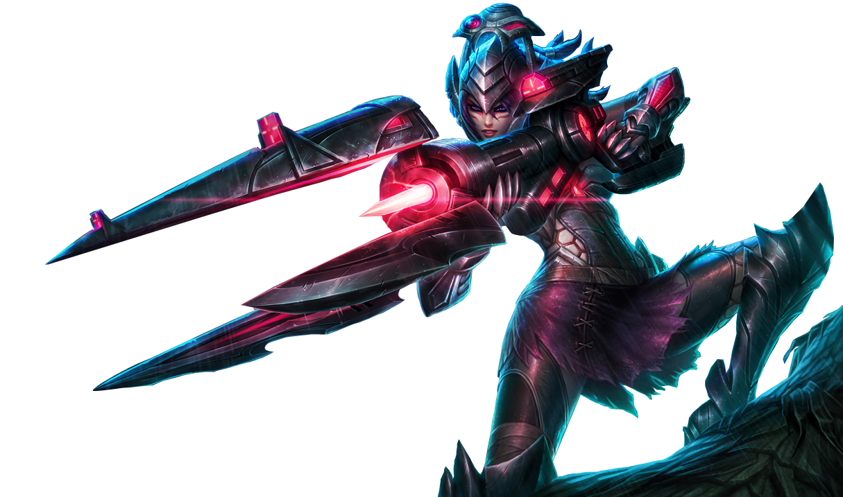
Anyway, I think it's a lot better but I'd still enlarge the render some more. I don't know if you resized it improperly or if the render was just not great to begin with but it still looks pretty blurry and rather low quality to me. Tbh it's kind of hard to do a good Headhunter Caitlyn signature when it's such an ugly skin in my opinion. Here's a good render though:
Anyway, I think it's a lot better but I'd still enlarge the render some more. I don't know if you resized it improperly or if the render was just not great to begin with but it still looks pretty blurry and rather low quality to me. Tbh it's kind of hard to do a good Headhunter Caitlyn signature when it's such an ugly skin in my opinion. Here's a good render though:
Kodaigan
<Member>
<Member>

If so, then you guys have hard times to give me any credit, since some of you don't like the skin/render/splash art.
But for me I am kinda drawn to it. I like dark mysterious glowy stuff. And since I love the gameplay of Caitlyn I had to like that skin too. And so forth.
Let me just ask you, did you just crop that out by yourself? If so good job. Almost cannot find any pixel errors. °-°
Thanks! I'm gonna work some more on this. I hope I can do this....haha..
Best Regards
Alain/Kodaigan
"One does not simply question a miracle." -Slumdog Millionaire
The figure used in this picture is not made by me.
Source:Link
Nah it's from DeviantArt. You've almost certianly heard of the site, but if not it should be your go-to for renders.
Kodaigan
<Member>
<Member>
Quoted:
Nah it's from DeviantArt. You've almost certianly heard of the site, but if not it should be your go-to for renders.
Yes I've heard from it. I'm also registered there. But there I only could show them, not ask for any tips though as here. Because personally this is better for me than Deaviant Art was ever for me. Personal Taste and so forth.
Well then, I experimented with the picture, although im having hard times adjusting the colour of that Umbrella texture. Gotta work on that. I may have already an Idea how to do so. But for now the new version.
I started to work on the placement of the text and the color. Right now it's ver. 0.2. I'm still getting ideas while im writing this haha. But first, I need opinions to continue.
I also know why it seemed to you so blurry. Because when you resize (smaller) a render and apply it, photoshop deletes the unneeded pixels. If you resize it again (bigger) those pixels are missing and as a result you get a much blurrier render.
Here goes nothing...
What do you guys think now? :0
Best Regards
Alain/Kodaigan
"One does not simply question a miracle." -Slumdog Millionaire
The figure used in this picture is not made by me.
Source:Link
That doesn't just happen in photoshop, it happens everywhere and you should probably try to not do it. In fact, trying to enlarge anything in photoshop will diminish its quality so try to avoid that. If you downsize something and then change your mind about it, delete that render and put in a new one.
Anyway I finally like the size of the render now, however I didn't mean that you should enlarge the entire signature, just the render. That thing could probably fit in a signature, but they are typically 500x150 or 500x200 in size. Anything over 200 pixels in height will have a tough time fitting in the signature, but even if it does it makes it impossible to add anything else in the signature.
Not sure I like the greenish in the background either.
Think there's too much space between Kodaigan and Nowhere to hide. Perhaps you should place Nowhere to Hide in the center of that little space, and lower the size of Kodaigan and place it over Nowhere to Hide. e.g. :


You need to log in before commenting.
But it's better imo atm.