


Thank you jhoijhoi, Keondre, LaCorpse, The_Nameless_Bard, Arcana3, Apfeljack, Hogopogo, eddie199, Xiaowiriamu, and JEFFY40HANDS for the spectacular sigs!

Wow, thanks for the great feedback!
I spent my Sunday afternoon making the tutorial for you: http://fav.me/d6ndct3
Hope it's useful!
I got my textures and bokehs just by searching the net and I can't really track them all down anymore. Here's the one I used for this tutorial, though: http://i.imgur.com/x8rNvpz.png
I spent my Sunday afternoon making the tutorial for you: http://fav.me/d6ndct3
Hope it's useful!
I got my textures and bokehs just by searching the net and I can't really track them all down anymore. Here's the one I used for this tutorial, though: http://i.imgur.com/x8rNvpz.png
And this is another signature that I made on short notice for Embracing. (Thanks for recommending me, Pengu. :P)

I guess it's not too special. He liked the style in the Kayle sig but since the images are so different from each other it wasn't possible to reproduce the same feel to it. So I kept this looking "bewitching".
I also thought that it's totally cool with Seraph's Embrace actually being a popular pick for AP Nidalees and the requester's name being Embracing. That's why I even drew a Seraphs Embrace for this and wrapped ribbon around the staff to complete the "embraced" look. :D
I think the idea is good ... the result maybe not. Still got much to learn!
Enough Photoshop for today.


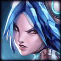
Image: https://scontent-a-pao.xx.fbcdn.net/hphotos-prn2/954899_10153325327940556_352741468_n.jpg
Text: Get Jinx'ed
Other: 500x150, I'd prefer just the face, but whatever you're able to do will probably be better.
Text: Get Jinx'ed
Other: 500x150, I'd prefer just the face, but whatever you're able to do will probably be better.


Thank you so much for the tutorial! Although I won't be using it any time soon because I'm horrid, I'll definitely be looking to implement that sort of style.
Also, I love the way you do your text in those boxes, they look awesome!
EDIT: Also, that fractal you provided is awesome! Came out looking pretty good (like a golden Sonic Wave / Resonating Strike)
Also, I love the way you do your text in those boxes, they look awesome!
EDIT: Also, that fractal you provided is awesome! Came out looking pretty good (like a golden


Your work is pretty distinguishable. It's energetic and flashy, I want some :3
Could you do something awesome with this?
Winter is Coming - Again!
I don't really want to restrict you in any way, but regarding the text: "Winter is Coming" and "Again!" separated similarly to your Vi art piece. but with the blue ice theme in mind.
Here are some font choices that might or might not look good: Medieval or Fire/ice font would be cool.
500x200.
Bring out the ice!
Signature byNatuhlee

You need to log in before commenting.
There you go! :D I hope you like it. I don't hate it but I don't love it either.
Also I had to make the render myself cause I couldn't find one. This splash art is a pain in the *** to render. :D
This looks amazing!!! Thanks~