


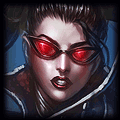


•Specific Champion? Singed (Snow Day Skin)
•Pop Out?: Yes
•Border: No
•Color Theme: Idc
•Any Text?: "On my way"
•Pop Out?: Yes
•Border: No
•Color Theme: Idc
•Any Text?: "On my way"

-NA- Veng Lmfao wrote:
Okay, the Garfield sig was definitely an improvement, nice job.
However, I think that Orange line cutting through Throat's name is not needed. I'd remove that if I was you.
Your banners for Bligen's Fiora guide look really nice, but I think the text could use some work.
I think that you should add an outer stroke (black) of 1 px and 75% drop shadow. That'll make the text really pop out and not look boring as it does now.
If you want to go even further you could add in a nice clipping mask, but it wouldn't work with that text.
Here is a banner that uses the stroke / dropshadow to make the text look better. It looked absolutely horrible before, and I still don't like it, but it was an improvement.
Give it a shot! It looks great, but it'll look even better afterwards (:
Thank you for that suggestion! Felt the same way about the text, Idk why I didn't do that in the first place lol. Let me know if you like this better:

97BligenN, you want me to do this to the chapter headers too? With those I don't think it's as necessary because there's a lot less going on since they are cropped. But still your choice just let me know.
Oh and with the Garfield one, I added that line cuz of his name, "throatslasher," like it was being slahsed. But here's a version without it:

BankaiNick wrote:
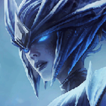
•Specific Champion?/More than one?/ Something or someone not League-related? Umm. I'd like mid champs like Karthus, Syndra, and lux preferrably in the middle.
•Pop Out?: Yes/No? Yes.
•Border: Yes/No?(Usually doesn't apply to Pop outs) No.
•Color Theme: Purple/Blue/Idc: Umm. Since there are two dark champions and a light one, try to use that team to give contrast to the champs.
•Any Text?: Summoner Quote/Any Quote/Summoner Name/None/etc... Put in big somewhere my name BankaiNick. and also somewhere smaller use Mada Mada Dane.
•Anything Else You can Think of!:) I really appreciated your time and efforts, and it's unneccesary for you to rush; i'm not impatient. :)
Here we are:
(I made two versions,all that's different is the text. Your pick:D)

OR

If there's something you don't like, or you'd like a completely different one just let me know!
Fiora and Garfield art is definitely a huge improvement. +rep for quality art and accepting feedback.
If you were going to slash his name, you should reverse the colors. Orange is a stronger tone and therefore attracts more attention.
If you want to keep that line, try doing the name in orange with a grey line going through, see how that comes out!
If you were going to slash his name, you should reverse the colors. Orange is a stronger tone and therefore attracts more attention.
If you want to keep that line, try doing the name in orange with a grey line going through, see how that comes out!
Natuhlee wrote:
Thank you for that suggestion! Felt the same way about the text, Idk why I didn't do that in the first place lol. Let me know if you like this better:
97BligenN, you want me to do this to the chapter headers too? With those I don't think it's as necessary because there's a lot less going on since they are cropped. But still your choice just let me know.
To me honestly the originals look good aswell :D But if you want to try something I don't mind ^^

-NA- Veng Lmfao wrote:
Fiora and Garfield art is definitely a huge improvement. +rep for quality art and accepting feedback.
If you were going to slash his name, you should reverse the colors. Orange is a stronger tone and therefore attracts more attention.
If you want to keep that line, try doing the name in orange with a grey line going through, see how that comes out!

I like it a lot better this way. Thanks for the rep! Gave you some too for helping me out :) The color thing makes a lot of sense, I'll try to implement in in future sigs.
You need to log in before commenting.
However, I think that Orange line cutting through Throat's name is not needed. I'd remove that if I was you.
Your banners for Bligen's Fiora guide look really nice, but I think the text could use some work.
I think that you should add an outer stroke (black) of 1 px and 75% drop shadow. That'll make the text really pop out and not look boring as it does now.
If you want to go even further you could add in a nice clipping mask, but it wouldn't work with that text.
Here is a banner that uses the stroke / dropshadow to make the text look better. It looked absolutely horrible before, and I still don't like it, but it was an improvement.
Give it a shot! It looks great, but it'll look even better afterwards (: