


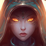


Her head is too big to fit into a sig =.=
@Emi: Tahnks for the font suggestion. I'm bad at picking fonts too. X3 And that banner is SICK! Can't see the divider though...
@Owen: I agree with Janitsu here.
Thanks to MissMaw for the sig!

Sticks and stones may break my bones, b*tch you can't phase me.
Ranked Misadventures
Ranked Misadventures


@Owen, I love the fonts! What's the one for "Violence" called?
@TheSilverDust, is Cass a render? If so you could just scale it down. If it's part of the background, you might be able to recover the cut-out parts and then just scale the entire sig down.
Imgur was being dumb and for some reason deleted that image, but I made a couple edits anyway:
With text:
Without text:
Made this sig myself :)


^ They're pretty cool but I think it would be better if the framespeed were a lot slower. I can imagine this being rather distracting while reading like this.
EDIT: That feel when you use ^ and your post's on a new page..
Also wanted to say I don't think I've ever seen gifs used like this in a guide before. Nice idea!
EDIT: That feel when you use ^ and your post's on a new page..
Also wanted to say I don't think I've ever seen gifs used like this in a guide before. Nice idea!
********'s a pretty good fertilizer


Thanks for the suggestions guys, I went ahead and made Aatrox a bit bigger.
Before:
After:
For some reason I like the first one better still, had to change the background around because I just used the Aatrox splash art, and not a render.
And the font I used for "Violence" is called 'Early Bird' on Dafont, Emi :)
Before:
After:
For some reason I like the first one better still, had to change the background around because I just used the
And the font I used for "Violence" is called 'Early Bird' on Dafont, Emi :)
Thanks to all hard working sig artists <3
"Thanks to Mikaiah for the wonderful sig <3"
| LeBlanc guide | Graphic Shop |
Thanks~ I really like that font, hehe.
And I kinda agree, I like the first one more. I think it's mostly because the text is aligned better (towards the left-side third so it mirrors Aatrox's position on the right-side third), whereas the second one is off in the corner by itself. If you had a render, you could possibly play around with the text and have it overlap his sword for better positioning, but idk. Both of them are pretty good, so don't mind me ^_^
And I kinda agree, I like the first one more. I think it's mostly because the text is aligned better (towards the left-side third so it mirrors Aatrox's position on the right-side third), whereas the second one is off in the corner by itself. If you had a render, you could possibly play around with the text and have it overlap his sword for better positioning, but idk. Both of them are pretty good, so don't mind me ^_^
Made this sig myself :)


I feel like this is my best stuff yet :)
Thanks to all hard working sig artists <3
"We will kill your enemies. That will be fun."
| LeBlanc guide | Graphic Shop |


You need to log in before commenting.
<Moderator>
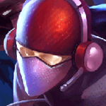
Signature by me =)