


Picture looks a bit pixelated, not sure if intentional or not. Also, the font looks weird to me (but that might just be me). Otherwise, I like it, nice job :)
|
|


Penita13 wrote:
Made this one myself. Any opinons / critiques?

The focal point could be bigger and more in the middle and make it pop out more. The font is somewhat hard to read and I think there are better fonts for this kind of picture. Maybe a border as well?
Vapora Dark wrote:
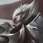
Made this one myself. Any opinons / critiques?
Seems to be too much damage in this one so it's pretty bad.


Janitsu wrote:
The focal point could be bigger and more in the middle and make it pop out more. The font is somewhat hard to read and I think there are better fonts for this kind of picture. Maybe a border as well?
Thnx. Will try to work on it next time.
Vapora Dark wrote:
Made this one myself. Any opinons / critiques?
Marvelous! Brava! Rembrandt would instantaneously portrude his eyes out due to jealousy. How much do you want for a 10Mx20M one?


You need to log in before commenting.
<Member>
Thanks to myself for the signature ^^
Check out my Xerath guide