Click to open network menu
Join or Log In
Mobafire logo

Join the leading League of Legends community. Create and share Champion Guides and Builds.

Create an MFN Account


Or

's Forum Avatar

MOBAVERSE Gallery

Creator: JEFFY40HANDS January 7, 2012 11:50am
4126 posts - page 49 of 413
Creator0
<Member>
Creator0's Forum Avatar
Posts:
9
Joined:
Oct 26th, 2011
Permalink | Quote | PM | +Rep January 19, 2012 12:37pm | Report
So, i figured id make a (more or less) serious sig.

Let me know what you think.
JEFFY40HANDS
<Altruistic Artist>
JEFFY40HANDS's Forum Avatar
Show more awards
Posts:
9281
Joined:
Aug 10th, 2010
Permalink | Quote | PM | +Rep January 19, 2012 12:54pm | Report
Really dark, IDK I DO like the background, but the whole thing feels unpolished if that makes sense. 6/10 from me.
Jovy
<Admin>
Jovy's Forum Avatar
Posts:
9615
Joined:
Nov 18th, 2011
Permalink | Quote | PM | +Rep January 19, 2012 12:57pm | Report

looks great jeffy ^__^
i think it's kinda funneh how it looks like it's coming out of his stomach :D


I agree with Jeffy, it's way to dark.

by jhoijhoi
JEFFY40HANDS
<Altruistic Artist>
JEFFY40HANDS's Forum Avatar
Show more awards
Posts:
9281
Joined:
Aug 10th, 2010
Permalink | Quote | PM | +Rep January 19, 2012 1:00pm | Report
It was an attempt to create depth

and I think Creator's idea was to create some sorta night scene with bombings OR meteors crashing down. Ergo the uber darkness.
Samoh
<Member>
Samoh's Forum Avatar
Show more awards
Posts:
855
Joined:
Nov 27th, 2011
Permalink | Quote | PM | +Rep January 19, 2012 1:13pm | Report
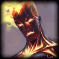
In actual fact that is a pretty nice sig when you really look at it, with the (I presume) meteors coming down, and Maokai being very dark, and looming over you. It has a lot of depth, but at first look I am not sold. 6.5/10 from me, I think it needs a lot of improvement but after looking at it a few times I've grown to like it a lot more :P Keep going, and thanks for the feedback on my sig Jeffy :> I like the streetfighter one, but I don't like that the C4d looks like it's coming out of his stomach to much, although it did create depth fo' sho.
Thanks to Koksei, The_Nameless_Bard,JhoiJhoi, LaCorpse, JEFFY40HANDS and myself for the signatures! I am also a certified gangster.
JEFFY40HANDS
<Altruistic Artist>
JEFFY40HANDS's Forum Avatar
Show more awards
Posts:
9281
Joined:
Aug 10th, 2010
Permalink | Quote | PM | +Rep January 19, 2012 1:20pm | Report
Thanks samoh. Its my first attempt at using a c4d in such a manner. I'm sure I could improve upon it I also really tried to emphasize lighting.
Jovy
<Admin>
Jovy's Forum Avatar
Posts:
9615
Joined:
Nov 18th, 2011
Permalink | Quote | PM | +Rep January 19, 2012 1:21pm | Report
^gl
be sure to post your next one :3
JEFFY40HANDS
<Altruistic Artist>
JEFFY40HANDS's Forum Avatar
Show more awards
Posts:
9281
Joined:
Aug 10th, 2010
Permalink | Quote | PM | +Rep January 19, 2012 1:22pm | Report
I always doooo hehehe
Bryun
<Magic Man>
Bryun's Forum Avatar
Show more awards
Posts:
2365
Joined:
May 1st, 2011
Permalink | Quote | PM | +Rep January 19, 2012 1:41pm | Report
Bryun wrote:

Really quick one, before school. Critiques?


wus ignored, boo!

jeffy y u so popular.

castlemanRC
<Member>
castlemanRC's Forum Avatar
Show more awards
Posts:
86
Joined:
Dec 8th, 2010
Permalink | Quote | PM | +Rep January 19, 2012 1:57pm | Report
Quoted:

That's a good point.
But I still like the font and text. I only think it would be better if the text was smaller, and out of the way of that little bush. Like this: (only with pretty font)


Or maybe with small txt on the left, over the dark area?

What do you think Amanda?
Thanks to NamelessBard, WaffleWarrior, Deathanatos, Samoh, LaCorpse and Jeffy40Hands for the sigs

You need to log in before commenting.

League of Legends Champions:

Teamfight Tactics Guide