


Wayne3100 wrote:
might have to ask some more veteran GIMP users (*cough* Amanda *cough*) whether there's any effect they often use.
I've used both :P
Wayne3100 wrote:
Also I started using bigger text after a friend told me the text I was using on my sigs was too small... Looks like I have to go back to small again now... <.<
Small text/Big text, doesn't really matter how large or small it is. It's just mostly about how the text will fit with the rest of your signature. Both big and small can fit well on the same sig. Some key factors that effect this are blending/placement/color/font choice.
however LARGE (bigger than render) texts tend to draw out the focus, making your text the signature's focal point. So if you want to use a large text but make the focal point on a render, it is done by placing the text near/next to the main focal point.

To celebrate that last night was "offial Derpy is now canon, day" i made a sig.
Nothing interesting or super fancy, just simple and cute :3
Nothing interesting or super fancy, just simple and cute :3
Thanks to me and Elleeeeeka (love that name) for my sigs.
If i made a helpful comment on your guide/build, then hit that +rep button. or don't, its not like i care.
ALL HAIL QUEEN CHRYSALIS!
tehAsian wrote:
So...do I just ask for CnC? :D
Try erasing some of the black portion of your fractal/c4d out from the main render/stock. in that way it doesn't mess up the render's color. And I would change (is that color dodge you used) to either screen/linear dodge


Wayne3100 wrote:
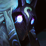
I actually really like this one, Wayne. I think maybe the opacity of the border should be lowered a bit to match the darkness of the surrounding signature, but at the same time, it's a bold colour just like the text. It's a great signature :)
You need to log in before commenting.
Thanks for the advice Jeffy, even though I unfortunately don't use Photoshop. I still have a lot of experimenting to do in terms of adding all sorts of effects to text, might have to ask some more veteran GIMP users (*cough* Amanda *cough*) whether there's any effect they often use.
Also I started using bigger text after a friend told me the text I was using on my sigs was too small... Looks like I have to go back to small again now... <.<
I really like the sig and the idea personally though, so I'll work on it and replace the text as many times as necessary until all of you love it ^^