


Quoted:
lol you painted that tristana yourself? oO
mhm dunno can't really cnc on this "goblin-style-tristana" ..:D
I like the backround. Easy but somewhat interesting.
The font style is awesome but it's plain black.
Lol seems wrong to cnc on something you did for me :/ I feel so bad
&
@ Malin:
Seems nice, but a lil bit too big in my opinion (the height)
the effects seem pretty nice, and like grand said mb add a border and text ;)
&
CNC Please :)
koksei wrote:
~ Sig by Xiaowiriamu ~


Been gone for nearly a week and this has only progressed a few pages? D:
Jeffy, absolutely LOVE that TimeWarp signature and yes, it would be a learning experience if you made a quick WIP timeline, or a tutorial or shared the PSD (if you're still comfortable with that idea). It looks like you got the best out of all worlds with it - smudging, C4Ds, brushes, great text placement and background. Fantastic job ^^
Bree: I like your simple name signature. It's really elegant.
Amanda: I think the blur is a bit too much on the signature of the red head.
Grey: LOVE the fractal pack! Thank you! They're gorgeous :)


GrandmasterD wrote:
The top one is the original one. I've added lighting effects, relief and sharpened the image and removed noise.
Wow Nick, I really like what you did here. You really did clean up the image for the better. As for the text... :/ The only way I think it will work is if you cut the image in half (length ways) and place the text at the new bottom in large and bulky text as if it is a movie poster. Does that make sense?
Transformers text, or Star Wars text would probably suit the style I'm suggesting ^^
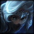
Malin: What a beautiful piece! Normally I would say the text is too large and stands out too much, but it just all looks really nice together. Perhaps my only criticism is the border, which maybe doesn't match the colour scheme. Oh, and now that I'm looking, it looks like half the hair is blue/black and then just suddenly cuts off to be pink. Her eyes also look a little washed out. But great work over all :)
Nyoike
<Member>
<Member>

Ny: I don't like the text either, but the rest is AWESOME. It may be over-topaz_crisp'd (easily fixed), but I believe it looks quite nice. Maybe you should download a few new fonts :)
Nyoike
<Member>
<Member>
ThisistheRightBuild
<Member>
<Member>


Orianna Guide // Ahri Guide // +Rep for hugs ♡ // Signature Café!!

A Special Thanks To Those Who Made Me Signatures
>> Graphic Resources & Downloads <<
You need to log in before commenting.
<Member>