


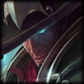


Hmm seems like you've messed too much with the focal point. Seems bit blurry, and the text is too sharp. The color adjustments made are nice. but i'll experiment more with the image adjustments, and maybe use lower opacity's for each.
EDIT: oh first attempt, wow this is impressive for a first attempt, keep going!
EDIT: oh first attempt, wow this is impressive for a first attempt, keep going!


Like Xiao said, the image ended up really blurry. Sometimes when you apply filters or textures over the top of a source, the image can deteriorate in quality. Try and back track what you did and pick out when the quality starts to drop, and try to find a way to achieve whatever it is you wanted to do, *without* making it blurry.
Addition of text looks pretty cool, but the biggest text looks a little sharp. Keep on playing with things! This is much better than my first attempt :)
Addition of text looks pretty cool, but the biggest text looks a little sharp. Keep on playing with things! This is much better than my first attempt :)
You need to log in before commenting.
<Member>