


-NA- Veng Lmfao wrote:
Super jealous of that Lasty sig, definitely not what I expected but it came out amazing.
+Rep
Don't stop making the great graphics!
Wow thanks haha. I tried a new technique, I really liked the outcome as well. I'll keep at it:). Said this before but I love your stuff as well. The Victorious Janna one you made is gorgeous.
C4 Lasty wrote:
That is freaking awesome! Thank you so much!
Of course! Glad you like how it turned out:D
Werepirelord wrote:
Something non-league related for once.
I'd like a signature of my profile picture with some added effects.
Link:http://static.comicvine.com/uploads/original/8/80297/1686295-klarion.jpg
Pop out: I'd adore a pop out.
Border: No thank you.
Color theme: Black/White would prove most affectionate.
Any text? Not really. If you find the time a second render with "Pff, baby magic." would be nice.
Additional notes: Really love what you did to BankaiNick's sig, so an effect similar to that one would be great.
Absolutely understand that time is of the essence, many thanks should you consider doing this.
So I had some difficulty with this one, especially when it came to making it plain black and white. I tried a lot of different designs with it black and white but it always looked wayyy too plain to me. Now if you still want that, and you don't like the ones I made cuz of the color or any other reason, please, don't be hesitant to tell me and I can try again. I really don't mind starting it over, if anything, it's a challenge as well as practice, both of which I enjoy. :) So enough jabbering, here you go:
No Text:
(I did two different versions of text, couldn't really choose one cuz I figured they both had appeal.)
Text One:
Text Two:


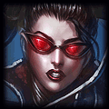
I prefer the 1st text arrangement. I'd move it about 50px or more to the left so that the text doesn't cover the cat's face. Nice sig though! For some reason the render looks a little washed out? Maybe if you apply a dark layer at a low opacity?

It's absolutely gracious, but if you don't mind I'd prefer the text a bit smaller.
I'm totally fine with it as it is though, but should you find yourself not preoccupied with anything it'd be amazing if you could just shrink the text on the third one, so that the sentence can be read in one line. Also apostrophies if you could, but all in all, I'm already very happy with as it is and consider your work done. :)
Edit: I agree with Jhoi's sentiments, but i still prefer the 2nd text sort.
Tah beh, or nat tah beh. BOOM! Nat tah beh.

•Specific Champion? God... (Aka Teemo)
•Pop Out?: Yes
•Color Theme: Idc
•Any Text?: Summoner Quote/Any Quote/Summoner Name/None/etc..."Teemo is God" RuNBlacK
•Anything Else You can Think of!: I'd like two, one hand-drawn (show me yo skillz) and one with whatever render you see fit.
(WATCH THE CAPITALIZATION OF MY SUMMONER....)
•Pop Out?: Yes
•Color Theme: Idc
•Any Text?: Summoner Quote/Any Quote/Summoner Name/None/etc..."Teemo is God" RuNBlacK
•Anything Else You can Think of!: I'd like two, one hand-drawn (show me yo skillz) and one with whatever render you see fit.
(WATCH THE CAPITALIZATION OF MY SUMMONER....)
jhoijhoi wrote:
I prefer the 1st text arrangement. I'd move it about 50px or more to the left so that the text doesn't cover the cat's face. Nice sig though! For some reason the render looks a little washed out? Maybe if you apply a dark layer at a low opacity?
Werepirelord wrote:
It's absolutely gracious, but if you don't mind I'd prefer the text a bit smaller.
I'm totally fine with it as it is though, but should you find yourself not preoccupied with anything it'd be amazing if you could just shrink the text on the third one, so that the sentence can be read in one line. Also apostrophies if you could, but all in all, I'm already very happy with as it is and consider your work done. :)
Edit: I agree with Jhoi's sentiments, but i still prefer the 2nd text sort.
I applied another layer, and it was really dark, so I lowered the opacity like ya said till I felt it looked better,but not too dark. I think the fact that the original image had some light source coming from below made it look a little off, at least while I made it into a sig. I just applied a black& soft brush to the area so that might have something to do with it? But anyways, thank you for your suggestion:) I think it helped it a lot.
and Werepirelord, wasn't sure watcha meant by apostrophies?Cuz to my knowledge none of those words have one?o_O Sorry, lol. Just want to make sure I get what you want. :) Here's an updated version for now:
You need to log in before commenting.
Do you take renders from the internet and customize them then or do you CREATE seperate renders and customize them and then add them together?
Also what program do you use?
If I can find a render on the internet, I take that over doing it myself because I've always found it to be a tedious process, that bores me quickly XD. If I can't find a render, or all the ones I find are cruddy, I do it myself by taking the splash art and using the pen tool. The sig I just did, I managed to find all those renders on the internet. DON'T TOUCH MY CARRY and THRESH and several others I did myself. it just depends. But sorry for the rambling, to answer your question, I always find/make individual renders and combine them the way I feel best. I use Photoshop cs4.