


Thanks to Koksei, The_Nameless_Bard,JhoiJhoi, LaCorpse, JEFFY40HANDS and myself for the signatures! I am also a certified gangster.
Alexanpt
<Editor>
<Editor>

Snip3d wrote:
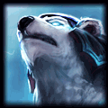
His neck is blue?
The text isn't even readable.
You have some red/orangish c4ds in the background on a blue theme.
There's no border.
Honestly, it sucks.
His neck is not blue, that's something he has for decoration. Don't you have eyes?
Lol can't you read the text? Everyone here can, except you.
Aren't they blended ? stfu
No border? What's the importance ?
Seriously
stfu. that's no criticism that's insulting.
Animes keep me on-going!
Elleeeeeka
<Member>
<Member>

- Maybe the sig a bit too simple?
- I think you could work on the text. I personally think the fact
that I have to tilt my head to read the text is really disturbing,
and is it on overlay? The effects/textures/stcosk
are like going through the text.
- I think border would look nice on this sig.
- I see a bit red/orange things in the background, but it's not that noticable.
And it's blended well so yeah, pretty nice. Thats a thumbs up for you :)
- You can always use stroke our outer glow on your text
to make it stand out.
Overall:
I'd probably say 7/10.
The render is too hot, mmm fairy tail <3
â–ºSig credits: Me
Alexanpt
<Editor>
<Editor>
Elleeeeeka wrote:
- Maybe the sig a bit too simple?
- I think you could work on the text. I personally think the fact
that I have to tilt my head to read the text is really disturbing,
and is it on overlay? The effects/textures/stcosk
are like going through the text.
- I think border would look nice on this sig.
- I see a bit red/orange things in the background, but it's not that noticable.
And it's blended well so yeah, pretty nice. Thats a thumbs up for you :)
- You can always use stroke our outer glow on your text
to make it stand out.
Overall:
I'd probably say 7/10.
The render is too hot, mmm fairy tail <3
lol, the render is too hot. XDD
Jellal is the hottest male char of fairy tail imo. XDD
;)
Btw, I don't really want to make the text stand out. x3
Thanks for the comment & critics!! ^ ^
Animes keep me on-going!
Baloo
<Member>
<Member>
Snip3d wrote:
His neck is blue?
The text isn't even readable.
You have some red/orangish c4ds in the background on a blue theme.
There's no border.
Honestly, it sucks.
If you knew anything at all man, you'd know having a single color isnt a good thing. It's good to mix colors up, obviously it can be dont badly, and borders arent important.
The text could use some work because he is right, you can barely read it.
You need to make the render blend a bit better with the background. I suggest using clipping masks, gradient maps, c4d's, smudging ect.
If you work on those, you'll improve the quality a lot. :D


Only criticisms i have is that the text is hard to read, but then again, well blended, if this was the intention? furthermore render seems to be a bit unsetting (like an anime character put in real life world, it looks odd) but by looking at a different perspective, ignoring the parts i;'ve just expressed, it looks well thought out, you've sort of got the right idea on what color scheme you're going for, the background looks good (nice use of resources).
Things to look out for or improve on
- Lighting (this is key, try maybe gradients at soft light 25% opacity, 40% fill - test the colors)
- Focus, maybe blur some areas, or sharpen others
- Text, and signature itself - whats the intention etc.
Other-than that, from other signatures you've produced, no offence, this is definitely an improvement^_^
Lazukin
<Member>
<Member>

I really like it. I do acknowledge all the things other people have said, but I really don't see them as flaws, while it's not a perfect sig, I don't see anything I don't like. Good job overall.

I make sigs, PM me if you want one :D (Thanks for the Nidalee sig, The_Nameless_Bard!)
You need to log in before commenting.
His neck is blue?
The text isn't even readable.
You have some red/orangish c4ds in the background on a blue theme.
There's no border.
Honestly, it sucks.
Nobody appreciates an ********, actually word it like criticism instead of just out right insulting.