


Eistod wrote:
Shouldn't be the names not maybe in another color? x:
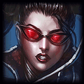
"Rengar", "Ryan Choi", and "IPodPulse" are the key words in the picture, hence the reason why they have a different font and different color
If you found me helpful give me some +Rep :)
Signature Shop!|Tryndamere Guide|Rengar Guide

Med Keizaal? Pruzah frolk tir Keizaal MobaFire Edition fah nahlriimaar ubaak Keizaal Undoro! Ahk saak kogaan wah Emikadon fah daar signature. Frolk tir ek jag het! Find out what I said by clicking here!
Med Keizaal? Pruzah frolk tir Keizaal MobaFire Edition fah nahlriimaar ubaak Keizaal Undoro! Ahk saak kogaan wah Emikadon fah daar signature. Frolk tir ek jag het! Find out what I said by clicking here!


^ I agree. If they are your key words, trying flipping the colors around or using a different color. The orange stands out A LOT more than the blue currently.
Hogopogo wrote:
^ I agree. If they are your key words, trying flipping the colors around or using a different color. The orange stands out A LOT more than the blue currently.
flipped them, looks better :)
If you found me helpful give me some +Rep :)
Also, since your text is so edgy (something like that -.-), try sharpening your rengar stock/render/whatever. Looks a bit smudged out currently.
Hogopogo wrote:
Also, since your text is so edgy (something like that -.-), try sharpening your rengar stock/render/whatever. Looks a bit smudged out currently.
:o that is the sharpened version
Edit: went for a different method of sharpening.
If you found me helpful give me some +Rep :)
IPodPulse wrote:
:o that is the sharpened version
Edit: went for a different method of sharpening.
That looks better sharpened that way. I also agree that the text is stronger with the colors flipped. I also like how you added the lines to the random spike in the foreground, it helps Rengar pop. This is a matter of opinion and preference but you might want to erase the stars/glowing dots around his body or more importantly face. This can help to make him pop more and make him more independent from the background. But like I said it's what you prefer, not necessary. Really nice piece though!
Natuhlee wrote:
That looks better sharpened that way. I also agree that the text is stronger with the colors flipped. I also like how you added the lines to the random spike in the foreground, it helps Rengar pop. This is a matter of opinion and preference but you might want to erase the stars/glowing dots around his body or more importantly face. This can help to make him pop more and make him more independent from the background. But like I said it's what you prefer, not necessary. Really nice piece though!
Will test it out, ill make an edit for when I finish erasing.
Edit: Layer masked the fractal and airbrushed it till the stars dispeared while trying to not lose the color. results turned out well
If you found me helpful give me some +Rep :)
Signature Shop!|Tryndamere Guide|Rengar Guide
Run out of zen for a signature? Stop by The_Nameless_Bard for a custom signature, all you have to do is ask!
Run out of zen for a signature? Stop by The_Nameless_Bard for a custom signature, all you have to do is ask!
You need to log in before commenting.
<Altruistic Artist>
Huge thanks too Magiciene for this amazing signature, check out his shop here