Click to open network menu
Join or Log In
Mobafire logo

Join the leading League of Legends community. Create and share Champion Guides and Builds.

Create an MFN Account


Or

MOBAFire's first Mini Guide Contest of Season 14 is here! Create or update guides for the 30 featured champions and compete for up to $200 in prizes! 🏆
's Forum Avatar

[Suggestion] A More Visible Way of Displaying...

Creator: Jpikachu1999 March 24, 2013 11:52am
Jpikachu1999
<Member>
Jpikachu1999's Forum Avatar
Show more awards
Posts:
1425
Joined:
Dec 19th, 2011
Permalink | Quote | PM | +Rep March 24, 2013 11:52am | Report


As you can see, that icon is pretty cool, and it is quite easy to see that Astrolia is Diamond 2.


However, in this picture, there is a ton of black space. It also took me like 5 minutes to realize that the icon for showing she is Diamond is part of her profile picture in the guide. Why can't we have those icons in that black space? Maybe stretch it out a little, but I would think it would be pretty cool, and much easier to find than the current setup.

If I helped you, click that +rep!
LiLStormcloaK
<Member>
LiLStormcloaK's Forum Avatar
Show more awards
Posts:
662
Joined:
Jan 22nd, 2012
Permalink | Quote | PM | +Rep March 24, 2013 12:03pm | Report
Seems like a good idea.
jhoijhoi
<MOBAFire Mother>
jhoijhoi's Forum Avatar
Show more awards
Posts:
14418
Joined:
Mar 20th, 2011
Permalink | Quote | PM | +Rep March 24, 2013 2:20pm | Report
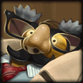
So something like this? (sorry for dodgy editing + quality, just wanted to get the idea out quickly)

Jpikachu1999
<Member>
Jpikachu1999's Forum Avatar
Show more awards
Posts:
1425
Joined:
Dec 19th, 2011
Permalink | Quote | PM | +Rep March 24, 2013 2:32pm | Report
Yeah, that would be great! I can imagine it being on the other side would be ok too, but that's exactly what I'm talking about.

If I helped you, click that +rep!
jhoijhoi
<MOBAFire Mother>
jhoijhoi's Forum Avatar
Show more awards
Posts:
14418
Joined:
Mar 20th, 2011
Permalink | Quote | PM | +Rep March 24, 2013 3:22pm | Report
Well, what's more important? The author, or that they're high elo? To me, I think it makes more sense to introduce the author first, and then everything else relevant, like elo, guide score, etc.
eddie199
<Member>
eddie199's Forum Avatar
Show more awards
Posts:
189
Joined:
Aug 27th, 2012
Permalink | Quote | PM | +Rep March 24, 2013 3:27pm | Report
I like the idea.
Rep+ me if earned


Check out my Kassadin build here
Thank you MissMaw, The Nameless Bard, Tinystar, Hogopogo and me for Sig
Jpikachu1999
<Member>
Jpikachu1999's Forum Avatar
Show more awards
Posts:
1425
Joined:
Dec 19th, 2011
Permalink | Quote | PM | +Rep March 24, 2013 3:47pm | Report
jhoijhoi wrote:

Well, what's more important? The author, or that they're high elo? To me, I think it makes more sense to introduce the author first, and then everything else relevant, like elo, guide score, etc.


I meant having it all the way on the right side next to the guide score percentage. Next to the Heart and Caution symbols.

If I helped you, click that +rep!
jhoijhoi
<MOBAFire Mother>
jhoijhoi's Forum Avatar
Show more awards
Posts:
14418
Joined:
Mar 20th, 2011
Permalink | Quote | PM | +Rep March 24, 2013 3:58pm | Report
It looked bad because of that reason. The symbols looked out of place squished between two blocks. However, if you were just thinking of using the elo badge without a square border, maybe it'd look fine.
LiLStormcloaK
<Member>
LiLStormcloaK's Forum Avatar
Show more awards
Posts:
662
Joined:
Jan 22nd, 2012
Permalink | Quote | PM | +Rep March 24, 2013 4:44pm | Report
I agree with Jhoijhoi, probaly better to put the 2 squares together.
Jpikachu1999
<Member>
Jpikachu1999's Forum Avatar
Show more awards
Posts:
1425
Joined:
Dec 19th, 2011
Permalink | Quote | PM | +Rep March 24, 2013 6:49pm | Report
It probably would be, I'm just tossing suggestions out. I'm not exactly the best at aesthetics :3

If I helped you, click that +rep!

You need to log in before commenting.
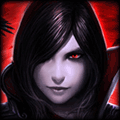
League of Legends Champions:

Teamfight Tactics Guide