


|
VOTING OPEN
|
Voting Rules: + Use the template provided (ie, give feedback) - this means that you vote 1st, 2nd and 3rd. + If you participated in the round, you have to vote. + If you do not vote, you lose your points, effectively disqualifying yourself from the round. + As per before, you receive 1 participation mark per round by voting. + You can vote if you did not participate in the round. + As a reminder, The_Nameless_Bard currently holds the most points! |
ROUND TWO
|
R1 End: 19/09/13 Vote Start: 20/09/13 Vote End: 24/09/13 R3 Start: 25/09/13 RULES 1) Don't vote for me. 2) Use stimulus provided. 3) Use correct dimensions. 4) Participants must vote. 5) Use voting template. 6) glhf! |
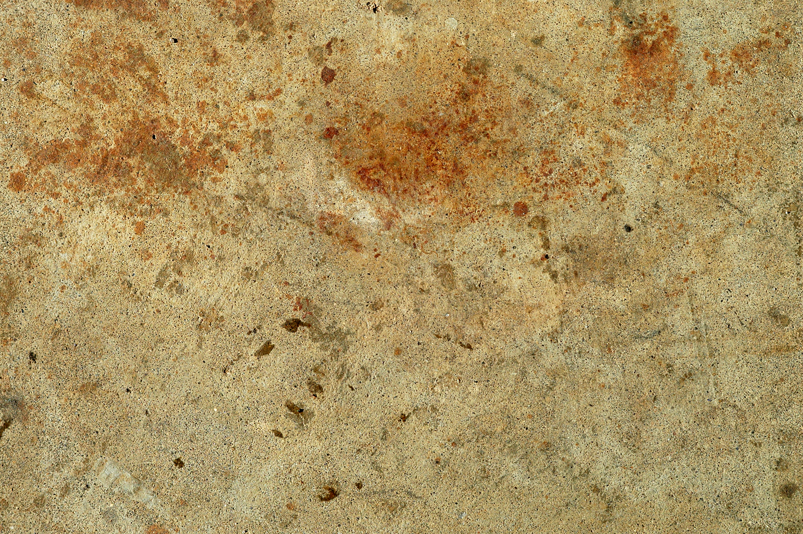
Mandatory Stimulus: LINK
 (use link for full size)  VOTING TEMPLATE VOTING TEMPLATE |
jhoijhoi wrote:
This is my example of what can be done with the stimulus:
|
ENTRIES
Test0ML wrote:
XeresAce wrote:
Bludes wrote:
Quoted:
YayaFTW wrote:
Shadow_Light wrote:
DR34MK1LL3R wrote:
mastrer1000 wrote:
The_Nameless_Bard wrote:
Hogopogo wrote:
fashionablellama wrote:
Thatdudeinthecotton wrote:
Kinen wrote:
Points
|
NAME - - - - - - - - - - - - - - Bludes DR34MK1LL3R Fashionablellama Hogopogo Kinen mastrer1000 MissMaw Shadow_Light Thatdudeinthecotton Test0ML The_Nameless_Bard XeresAce YayaFTW |
PARTICPATION - - - - - 1 1 1 1 - 1 - 1 - 1 1 1 1 |
R1 - - - - - - 3 19 19 - - - - - 8 26 8 16 |
R2 - - - - - x x x x x x x x x x x x x |
R3 - - - - - x x x x x x x x x x x x x |
R4 - - - - - x x x x x x x x x x x x x |
R5 - - - - - x x x x x x x x x x x x x |
TOTAL - - - - - x x x x x x x x x x x x x |


1st (3 Pts): Test0ML - I honestly just love everything about your sig. Zed looks fierce, the texture is used very nicely and fits with the image, blending is great.. There isn't really a lot I can criticize. Amazing job!
2nd (2 Pts): The_Nameless_Bard - Love the colors, love the blending, love the little sparkly effects and the use of the texture. It's there but it isn't the main focus of the image, despite that it manages to enhance the image greatly. Awesome job!
3rd (1 Pt): Fashionblellama - I love the simplicity. The subtle green fractal adds a little extra charm that made it number 3 for me :3 I also love the brightness & contrast and how the lighting works. Great job!

Lol, I removed the underlining because it looked really jarring and in your face, the sig was meant to be more mellow. Now for voting!
1st (3 Pts): Shadow_Light - Brilliant choice and positioning of render, the focal of the face transitions smoothly to the next focal with the sword. Colours are really appealing and the background is deliciously tactile. The borders look great and really complement the ornamentation on the render's sword. My one suggestion is that a better sense of depth might have been achieved by softening the rear arm, perhaps a little bit of a blur on the edges or blending of some background colours along the edge.
2nd (2 Pts): Test0ML - Brilliant use of the texture to create a tactile background reminiscent of traditional media. Amazing touches of paint around Zed, it looks really dynamic and brings out the render nicely while also blending it in (kinda contradictory, unless you get my gist). Only criticism is that the focal is off. My eye naturally falls a little bit to the right of Zed's head.
3rd (1 Pt): MissMaw - A lovely choice of render well positioned and incorporated into the rest of the sig. The text is brilliant, massive kudos for that, it just looks so perfect. The colour scheme is gorgeous with some really nice splattering, but it's a little washed out. I think the sig lacks some sort of great dynamic contrast to pull it ahead.
This is one hell of a close round (I mean Obscenely close), but here are my personal picks:
1st: The_namless_bard: Excellent use of the source, flawlessly stylized. Really don't have any criticisms for it.
2nd: Test0ML: Equally as impressive as namless's in terms of editing and execution. It simply boiled down to a slight preference of the smoother look on namless's pic.
3rd: Hopopogo: Really good use of the texture, has a bit of an apocalyptic vibe going for it :)
Criticism for it....well....itd be sorof awkward to put text on it......maybe.... (I'm really pulling for straws here, I mean, its pretty damn flawless XD).
HARDEST ROUND TO JUDGE EVER


Thatdudeinthecotton wrote:
Hopopogo
I think you got his name wrong in a really funny way :D
Anyway, here is my vote:
1st (3 pts): MissMaw - I am amazed by the background and the color scheme she pulled off based only on the stimulus and good color shades.
2nd (2 pts): XeresAce - If only the render was blended in a smoother way with the background rather than sources of light that takes way too much space from the background imo. Still, it's an awesome sig.
3rd (1 pt): The_Nameless_Bard - Amazing sig as always! I have a hard time noticing the stimulus as it's on a low opacity, but I trust your taste and believe that any higher opacity would make the BG too grungy :D


first place (3)- Miss Maw: I love the colors and how it all comes together...not much else to say about it
second place (2)- Yaya: I like the composition and the way it all looks...the topaz work just makes it.
third place (1)- XeresAce: I just love the color scheme of this...it looks so pretty and fits the image really well.
I don't really have any criticism that I haven't already posted :3
second place (2)- Yaya: I like the composition and the way it all looks...the topaz work just makes it.
third place (1)- XeresAce: I just love the color scheme of this...it looks so pretty and fits the image really well.
I don't really have any criticism that I haven't already posted :3
Pwnzor1130
<Member>
<Member>

1st (3 pts): The_Nameless_Bard - Amazing sig all around, though perhaps the right side is still a bit dark?
2nd (2 pts): MissMaw - Perhaps a bit too bright but otherwise it's superb. It definitely has a nice background pattern.
3rd ( 1 pt): Test0ML - I really liked the use of the sample and it's well-done overall.
2nd (2 pts): MissMaw - Perhaps a bit too bright but otherwise it's superb. It definitely has a nice background pattern.
3rd ( 1 pt): Test0ML - I really liked the use of the sample and it's well-done overall.
Thanks to The Nameless Bard and Vavena for the sigs!


1st (3 Pts): Hogopogo - the background is amazing. nothing to critisize.
2nd (2 Pts): The_Nameless_Bard - i really like those particles that are flying around in the sig. consider yourself first, i only like the colors the hogo chose more.
3rd (1 Pt): Test0ML - the paint that you put around the render looks great! also same as nameless, consider yourself first :)
qq i really want to give more people points.
You need to log in before commenting.
IT WAS THE CENTERPIECE OF YOUR SIG!