


I'm not going to get my submission in, alas. I'm kinda down in the dumps and I don't think it's worth forcing myself to finish it. Still. Next week brings another stimulus! Good luck to everyone who has entered! Do you have to have entered a submission to vote, or can you do the whole voting even without entering?

turns out my day is totally full so i doubt ill be submiting mine :/ i'll just wait for round 2 i guess unless i can get home in time
Edit: did I make it?

I'm not too happy with the font but other than that I think it came out pretty well. The fractal could have used a bit of smudging/blurring but w/e I'll live with it.
Edit: did I make it?
I'm not too happy with the font but other than that I think it came out pretty well. The fractal could have used a bit of smudging/blurring but w/e I'll live with it.


|
VOTING OPEN
|
Voting Rules: + Use the template provided (ie, give feedback) - this means that you vote 1st, 2nd and 3rd. + If you participated in the round, you have to vote. + If you do not vote, you lose your points, effectively disqualifying yourself from the round. + You can vote if you did not participate in the round. |
|
BATTLE ARTIST
|
Title Confirmed! + Mowen has confirmed that having the most points at the end of 5 rounds will grant you the title "Battle Artist" + The next 5 rounds then denotes who deserves to wear "Battle Artist" |
ROUND ONE
|
Vote Start: 08/09/13 Vote End: 11/09/13 R2 Start: 12/09/13 RULES 1) Don't vote for me. 2) Use stimulus provided. 3) Use correct dimensions. 4) Participants must vote. 5) Use voting template. 6) glhf! |
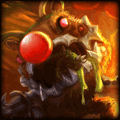
Mandatory Image: LINK
 (use link for full size)  VOTING TEMPLATE VOTING TEMPLATE |
jhoijhoi wrote:
This is my example of what can be done with the stimulus:
|
ENTRIES
Hogopogo wrote:
The_Nameless_Bard wrote:
Shadow_Light wrote:
Bludes wrote:
fashionablellama wrote:
YayaFTW wrote:
XeresAce wrote:
Test0ML wrote:
mastrer1000 wrote:
DR34MK1LL3R wrote:
ROUND ONE - Points
|
NAME - - - - - - - - - - - - - - Bludes DR34MK1LL3R Fashionablellama Hogopogo mastrer1000 Shadow_Light Test0ML The_Nameless_Bard XeresAce YayaFTW |
PARTICPATION - - - - - x x x x x x x x x x |
R1 - - - - - x x x x x x x x x x |
R2 - - - - - x x x x x x x x x x |
R3 - - - - - x x x x x x x x x x |
R4 - - - - - x x x x x x x x x x |
R5 - - - - - x x x x x x x x x x |
TOTAL - - - - - x x x x x x x x x x |
VOTING OPEN
1st (3pts): The_Nameless_Bard - Because I am amazed by how well she does the little details. The clipping mask on the sorta splatter/dust like particles around syndra, and how the focal comes out simply got me.
2nd (2pts): Hogopogo - The only one with guts to actually attempt a smudge. It actually came up pretty sweet, and I like originality.
3rd (1pt): FashionableLlama - If only the focal was a little bit on the right and Syndra's right half was little bit lighter, It'd have clinched the 2nd spot for me. It has the best text of all sigs aswell.
1: Nameless - That is freaking amazing. I love the background and the little shatters. Pretty legit.
2: YayaFTW - bro. I love the fact that you opened your shop because this is amazing. Has a pretty good balance of brightness and such. Only reason I'm putting you second is because you just BARELY have a little too much light compared to the render imo. Would have been a sure first place if you had that right (no offense nameless :P)
3: Test - dude this sig was pretty amazing. Got a nice full feeling and I like the background. Only problem was the little swoop on her backside and the light source on her hand. If that was a bit darker and the white on her backside was a little better blended you surely would have placed higher with me. Overall amazing job either way.
You guys did ridiculously good, and good luck with the polls.
Thanks to virusNG1

1st (3 Pts): DR34MK1LL3R. I liked the simplicity. It's not painful to look at. The wording could use a little smoothing (especially on the Y).
2nd (2 Pts): XerasAce. You've made the image more dynamic, just the lightning it a bit too bright and distracting, to the point the bottom left is almost painful to look at.
3rd (1 Pt): Tst0ml. Also a bit bright, but less sharp on the eyes. I can see you've tried to mix foreground and background, but the effect looks a little strange mostly due to the pose not working so well for such a thing (not really your fault).
A lot of these looked like they wanted to do something with the hands, but I feel like that's a fast track to distraction. In JJ's example its the details you pick up on. The necklace shines. The background and foreground blur so the focus is on one place, her face. It highlights what it wants you to see and doesn't clutter the picture with effects.
I'm just sayin', try a subtler contrast/effect next time.
Never Stop Making!
1st (3 Pts): XeresAce - like I said earlier, I really liked how you place the render in such a manner that it looks like she's falling; you managed to blend the render and the background quite well, it doesn't look like you've just pasted it there. It is a bit bright, however, so that's something I'd change. You could also apply a border.
2nd (2 Pts): YayaFTW - I actually feel as if the brightness of your signature makes it unique. The colour scheme is pretty much flawless and I really think the blending of render and background is good with the fractals on top. My only complaint would be that the render possibly could have been bigger, and in the end, there is a lot of empty space.
3rd (1 Pt): Hogopogo - Love the smudging and how she sort of looks like she's in a fiery haze (know what I mean? Like when it's really hot and there's distortion). What I didn't like was the glowing fractals placed on top, which seem out of place.
Honourable Mentions (0 Pts):
+ NamelessBard - I really love the contrast of colours, but the render just looks slapped on :/
+ Mastrer - I liked your signature, but I didn't like the green outline on the render.
+ Test - You came really close to being placed 3rd for me!
+ ShadowLight - I liked your placement of the render the most, especially with a thinner signature size.

1st (3 Pts): NamelessBard - I prefer the purple colour over the bright yellow that is prevalent over most of the submissions. Simple but good
2nd (2 Pts): Fashionablellama - A bit excessively bright to look at, but the contrast is cool.
3rd (1 Pt): Hogopogo - This would probably be my second highest, as it is definitely one of the more complex ones, and still looks good, but the misquoting is distracting :P (So much untapped power)
2nd (2 Pts): Fashionablellama - A bit excessively bright to look at, but the contrast is cool.
3rd (1 Pt): Hogopogo - This would probably be my second highest, as it is definitely one of the more complex ones, and still looks good, but the misquoting is distracting :P (So much untapped power)
You need to log in before commenting.
<Editor>