


|
VOTING OPEN
|
Voting Rules: + Use the template provided (ie, give feedback) - this means that you vote 1st, 2nd and 3rd. + If you participated in the round, you have to vote. + If you do not vote, you lose your points, effectively disqualifying yourself from the round. + As per before, you receive 1 participation mark per round by voting. + You can vote if you did not participate in the round. + As a reminder, The_Nameless_Bard currently holds the most points! |
Current point breakdowns (up to MissMaw's comment):
Test: 3 + 2 + 2 + 1 + 1
Amanda: 2 + 3 + 1 + 3 + 3 + 2 + 2
Llama: 1 + 1
Shadow: 3
Maw: 1 + 3 + 3 + 2 + 1
Hogo: 1 + 3
Xeres: 2 + 1
Yaya: 2 + 2 + 3
ROUND TWO
|
R1 End: 19/09/13 Vote Start: 20/09/13 Vote End: 24/09/13 R3 Start: 25/09/13 RULES 1) Don't vote for me. 2) Use stimulus provided. 3) Use correct dimensions. 4) Participants must vote. 5) Use voting template. 6) glhf! |
Mandatory Stimulus: LINK
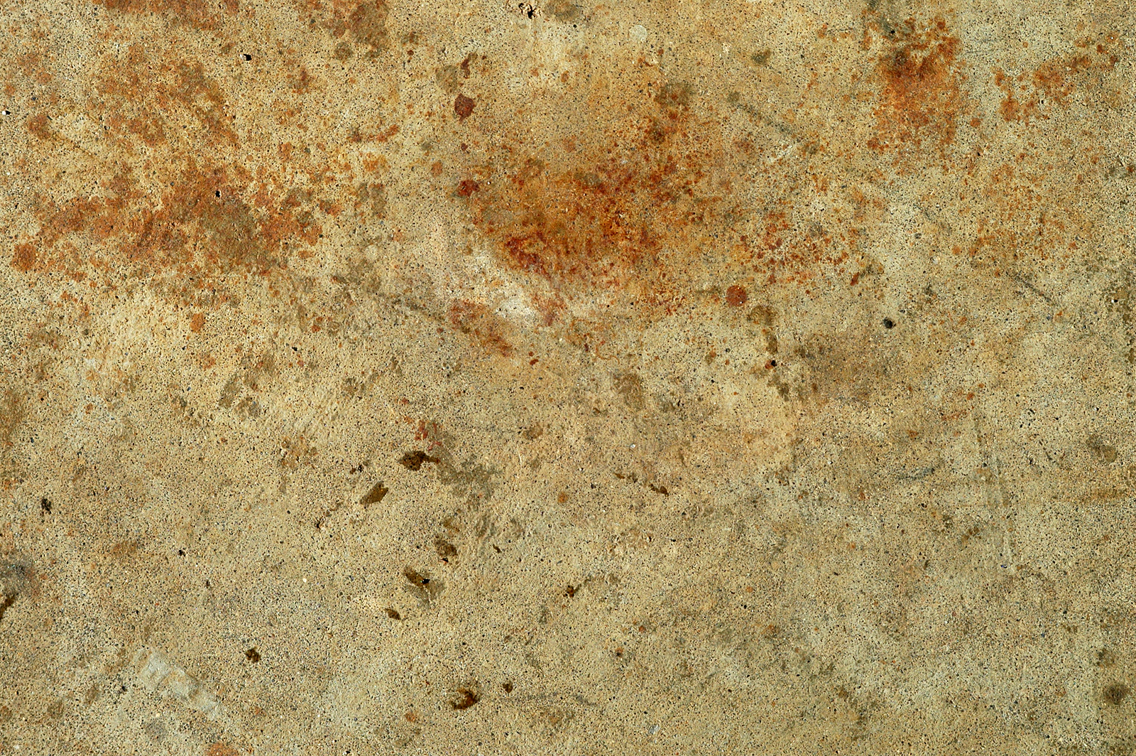 (use link for full size)  VOTING TEMPLATE VOTING TEMPLATE |
jhoijhoi wrote:
This is my example of what can be done with the stimulus:
|
ENTRIES
Test0ML wrote:
XeresAce wrote:
Bludes wrote:
Quoted:
YayaFTW wrote:
Shadow_Light wrote:
DR34MK1LL3R wrote:
mastrer1000 wrote:
The_Nameless_Bard wrote:
Hogopogo wrote:
fashionablellama wrote:
Thatdudeinthecotton wrote:
Kinen wrote:
Points
|
NAME - - - - - - - - - - - - - - Bludes DR34MK1LL3R Fashionablellama Hogopogo Kinen mastrer1000 MissMaw Shadow_Light Thatdudeinthecotton Test0ML The_Nameless_Bard XeresAce YayaFTW |
PARTICPATION - - - - - 1 1 1 1 - 1 - 1 - 1 1 1 1 |
R1 - - - - - - 3 19 19 - - - - - 8 26 8 16 |
R2 - - - - - x x x x x x x x x x x x x |
R3 - - - - - x x x x x x x x x x x x x |
R4 - - - - - x x x x x x x x x x x x x |
R5 - - - - - x x x x x x x x x x x x x |
TOTAL - - - - - x x x x x x x x x x x x x |


1st (3 Pts): master1000 + I really liked the simplicity of it all. Maybe a bit more contrast or saturation on the darker blue would have been better, but the stylization works well.
2nd (2 Pts): XeresAce + A bit too much brightness on the character's hands but it all feels nice.
3rd (1 Pt): YayaFTW + FFXII? Either way, the background stands up a bit too much, competing with the girl in the image. It gets a bit distracting.
other feedback (because more space for improvemente is what needs more feedback):
Test0ML: I really wanted to give you some points but there are only this many...! you made an interesting play of hue. However, something should stand out more due to the rather large dead and plain space under the charecter's arm.
Bludes: It just doesn't seem your work is well thought out. It is almost one dimentional. If you wanted to keep one color you have to play with luminosity and similar effects, maybe some contours! Make something stand out!
MissMaw: the character blends in too much with the background, especially due to her lack of depth/shadows. Also the one color scheme with low intensity doesn't favor the not-so-white background.
Shadow_Light: yellow is a very powerfull color. I just think you overdid it. A bit more of a colder color, maybe dull like grey blue could tone it down slighlty. Not much, just in simple details, just like the chestplate and hair. other thing that bothers me is the presence of a light on the opposite side of the main feature of the image, which seems to be the warrior's face.
DR34MK1LL3R: Just a bit too featureless for me. =3
The_Nameless_Bard: you actually don't need points from me. :P
However, your works always seem very well balanced and aesthetically pleasing. this time i only want to point out how the light in the background seems uneven, especially over his shoulders.
Hogopogo: the background is very opaque and doesn't match the smoothness of the figure. it's shapes, however, fit very nicely.
fashionablellama: Seems good, but there is something I can't quite point out. Maybe her expression isn't matched as a focus of the image... IDK, but there is something slightly off.
Thatdudeinthecotton: I am a person that likes contrasts, but this doesn't go well for me. Red and yellow are very strong colors, especially when in contact. Also the "flame" lacks a bit of volume, comparing with the figure that has some well defined shapes.
Kinen: the couple should stand out. Not the petals and feathers. Also, the text doesn't seem well fitted in that space. the figures blend with the background too, which is very unnapealling, i think.

1st (3 Pts): Hogopogo - I like the effects you did there but I think is a bit too much,everything else looks so nice.
2nd (2 Pts): Shadow_Light - I like the signature but I think you overdid it a bit with the lights.
3rd (1 Pt) : XeresAce - Too much white like I can't see her hand.
2nd (2 Pts): Shadow_Light - I like the signature but I think you overdid it a bit with the lights.
3rd (1 Pt) : XeresAce - Too much white like I can't see her hand.

1st (3 Pts): YayaFTW - I love the light and the colours from the girl.
2nd (2 Pts): fashionablellama - the lines make it
3rd (1 Pt) : Hogopogo - can't say any bad - had to make a discision for these three and there were close for my unskilled noob eye. D:
2nd (2 Pts): fashionablellama - the lines make it
3rd (1 Pt) : Hogopogo - can't say any bad - had to make a discision for these three and there were close for my unskilled noob eye. D:

1st (3pts) NamelessBard: It just looks too good, especially after you edited it :) Perhaps a bit more sharpening where his head is but thats personal opinion.
2nd (2pts) TestOML: It looks really good, zed looks like he's going through some pretty rough rain. Although its rough rain, it might be a bit too rough. Certain parts are too blurred into the background to the point where the focal isn' really focal.
3rd (1pt) MissMaw: I really like the colors and the brushing. However, some parts were a bit too rough (her left armpit, there's a blue square/splotch). Other than that, I like it.

You need to log in before commenting.
2nd (2 Pts): The_Nameless_Bard | I really like your sig but mhhh so hard to point. Gave feedback already
3rd (1 Pt): fashionablellama | Really like the colors and I like how you incorporated the texture. I'd add a border or make it more noticable. If you could figure out how to add text to it and make it look good, I think that'd really make it awesome.