


Looks awesome! Only thing I can add is that you could make the buttons square instead of rectangular, and also the text needs additional kerning; in the "character" text box thingy you'll see the option for size and then to the right "<VA>" - this tool adds space between letters, try playing around with it. Also, the text could be a few pixels more above the hearts.
Am looking forward to the guide update :)
Am looking forward to the guide update :)


Janitsu wrote:
Well I guess it's kinda dark imo. I'd maybe make the face a bit brighter?
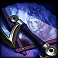
Hows this then, I adjusted the curves to make is more brighter, it does fit with the background more
If you found me helpful give me some +Rep :)
Signature Shop!|Tryndamere Guide|Rengar Guide

Tired of nightmares? Why not have a fantasy! Stop by Uproar's Design Workshop for some signatures you could only dream of.
Tired of nightmares? Why not have a fantasy! Stop by Uproar's Design Workshop for some signatures you could only dream of.
You need to log in before commenting.
<Altruistic Artist>