


I find one of the best ways to see how I am improving at graphics is to go back and try to improve a graphic that I previously made.
Here's what I did a few months ago:

Here's what I did now:
Changed up a whole bunch of stuff, especially the face, tried to soften it up. Also changed her mouth to make her look more...determined.
Here's what I did a few months ago:
Here's what I did now:
Changed up a whole bunch of stuff, especially the face, tried to soften it up. Also changed her mouth to make her look more...determined.
Thanks to all hard working sig artists <3
"Thanks to jhoijhoi for the wonderful sig <3"
| LeBlanc guide | Graphic Shop |


I'm awful at choosing fonts, but perhaps this one?
On a different note, I'm trying something new for my Sona guide. Been playing around with Adobe After Effects, and the result is pretty neat!
and the accompanying divider:
On a different note, I'm trying something new for my Sona guide. Been playing around with Adobe After Effects, and the result is pretty neat!
and the accompanying divider:
Made this sig myself :)
That banner is so damn cool... looks awesome.
(cant see the divider so can't comment on that, I'm sure its amazing!)
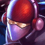
I'm thinking about doing a personal sig challenge, called "From A-Z Sigs" or something like that, where I basically go through every champ in LoL (A-Z) and make a sig for them!
Started things off with Aatrox:
Probably going to try to make two a week, up next is Ahri!
(I'm open to any and all critisicm, always trying to get better)
(cant see the divider so can't comment on that, I'm sure its amazing!)
I'm thinking about doing a personal sig challenge, called "From A-Z Sigs" or something like that, where I basically go through every champ in LoL (A-Z) and make a sig for them!
Started things off with Aatrox:
Probably going to try to make two a week, up next is
(I'm open to any and all critisicm, always trying to get better)
Thanks to all hard working sig artists <3
Thanks to Nameless for this amazing sig!
| LeBlanc guide | Graphic Shop |
You need to log in before commenting.
Brand too!