


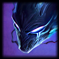
I actually like both sigs :)
The newer one is more flashy, while the second one is more conservative.
The newer one is more flashy, while the second one is more conservative.
xx22xx22xx22xx
<Member>
<Member>
Lakapooty
<Member>
<Member>
Can you make an Akali Stinger sig?
Text: Lakapooty
Underneath: Dance in the shadows
Font: The scratchy/bloodlike font
Color of pic: Whatever you think looks best
Color of text: Blood Red
Please make this and <3 you forever!
Text: Lakapooty
Underneath: Dance in the shadows
Font: The scratchy/bloodlike font
Color of pic: Whatever you think looks best
Color of text: Blood Red
Please make this and <3 you forever!
Thanks to AlexanPT , WRAthoFVuLK, and me for the ROCKIN' sigs!!!


hehe thanks guys
yea the 2nd isn't too bad, but it didn't have a lot of the artistic fundamentals as well as work put in as the new one did...the 2nd one only had some smudging and random blood brushes, and a fractal, and clipping mask text in it, and it took me forever to do since I had no clue how to really do it yet xD
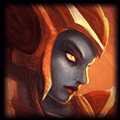
This one is for one zoomed in, has Topaz effect, tinted fractals in background, sharpened, has a lot of recoloring/vibrancy/photo/level filters, has clipping mask text, and a BORDER. xD
yea the 2nd isn't too bad, but it didn't have a lot of the artistic fundamentals as well as work put in as the new one did...the 2nd one only had some smudging and random blood brushes, and a fractal, and clipping mask text in it, and it took me forever to do since I had no clue how to really do it yet xD
This one is for one zoomed in, has Topaz effect, tinted fractals in background, sharpened, has a lot of recoloring/vibrancy/photo/level filters, has clipping mask text, and a BORDER. xD
Thanks to TRUeLM, Plastictree, Scrax, Xiaowiriamu, foggy12, JahGFX, jhoijhoi, msrobinson, JEFFY40HANDS, Nyoike, MissMaw, and me :) for the sigs!
Lakapooty wrote:
Can you make an Akali Stinger sig?
Text: Lakapooty
Underneath: Dance in the shadows
Font: The scratchy/bloodlike font
Color of pic: Whatever you think looks best
Color of text: Blood Red
Please make this and <3 you forever!
Some of that info I don't need...for instance, color of text (I use clipping mask), and color of pic (...you gave me a pic, and I usually use the color theme of that pic).
I'll try to fit the second line of text in, but it might look bad depending on the splash and how I position it.
And, err, a bloody font might look really weird in that splash...o_O
Thanks to TRUeLM, Plastictree, Scrax, Xiaowiriamu, foggy12, JahGFX, jhoijhoi, msrobinson, JEFFY40HANDS, Nyoike, MissMaw, and me :) for the sigs!
Lakapooty
<Member>
<Member>
xD alright, I'll see what I can do, it won't be done for a while though since I have over 10 requests before yours (see front page list) xP
btw jhoi I can't thank you enough for recommending this new shop format to me, I'm stupid for not thinking of it earlier xD
btw jhoi I can't thank you enough for recommending this new shop format to me, I'm stupid for not thinking of it earlier xD
Thanks to TRUeLM, Plastictree, Scrax, Xiaowiriamu, foggy12, JahGFX, jhoijhoi, msrobinson, JEFFY40HANDS, Nyoike, MissMaw, and me :) for the sigs!
NinjaGinge
<Editor>
<Editor>
Curses this is a hard choice! They look so sweet! Tbh i might save more than one. <3
I like the one right above the gun but I'm afraid it may not stand out enough.
One on the collar is cool too but it's kinda small.
One on the gun is boss but concern is same as above the gun.
On any one of them, might I ask for a touch more contrast on the text? Heck even in a complimentary color if you think it looks better.
EDIT: Good call on just the name.
The most in depth guide to Twitch around.
Props to wRAthoFVuLK for the beastly sig and putting up with my request XD
Hey, you should help me on acquiring Medieval Twitch!! :D
http://signup.leagueoflegends.com/?ref=507f1031d2ab3250817727
tbh, what you want to do to make the text stand out more is exactly what you don't want to do...you want to blend the text so that it DOESN'T stand out, since if it does it will draw attention to it and take away from the focal :S
I can make the collar one a brighter color if you want just to show you how bad it would look LOL
although just in white might be OK.
EDIT: brb
EDIT EDIT: Here:

Made the text white with a low opacity clipping mask so that it stands out a little more but is still blended; any more white and it looked really bad, trust me.
so, that vs.
I can make the collar one a brighter color if you want just to show you how bad it would look LOL
although just in white might be OK.
EDIT: brb
EDIT EDIT: Here:
Made the text white with a low opacity clipping mask so that it stands out a little more but is still blended; any more white and it looked really bad, trust me.
so, that vs.
Bloofyre wrote:
May a squadron of beautiful vaginas find their way to your crotch by day's end.
Thanks to TRUeLM, Plastictree, Scrax, Xiaowiriamu, foggy12, JahGFX, jhoijhoi, msrobinson, JEFFY40HANDS, Nyoike, MissMaw, and me :) for the sigs!
You need to log in before commenting.
that is really inspiring man