


IPodPulse wrote:
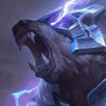
I was looking for that artist. Anyway thanks for the signature, what font did you use for the "Lucian" text? Also nice nebula image you used for the base, do you have a link? Final thing, can you check your inbox? I messaged you about something that is a problem for both of us.
Bright Young Things


IPodPulse wrote:
I was looking for that artist. Anyway thanks for the signature, what font did you use for the "Lucian" text? Also nice nebula image you used for the base, do you have a link? Final thing, can you check your inbox? I messaged you about something that is a problem for both of us.
Font: Bright Young Things (It's in LaCorpse signature resource cafe)
Nebula: http://gjftdc.deviantart.com/art/Nebulas-Pack-01-322811410 (It's in LaCorpse's signature resource cafe aswell)
I got your PM :)
Alright thanks guys for the font and nebula pack
If you found me helpful give me some +Rep :)
Signature Shop!|Tryndamere Guide|Rengar Guide

Undying Rage lasts 5 seconds, but love lasts forever. So why not check out jhoijhoi's signature store for signatures you will love for sure!


YayaFTW wrote:
Derp, took me way too long to realise this was for a Lucian guide =.=
Below is a Facebook cover for a group I'm part of... they held an informal competition to replace the banner they had been using for the last year (mine) and they decided to run with the second image posted. I'm a little annoyed :P (this happened a while ago, now) I can see that I over-sharpened the background of the image (or that could just be Facebook pixelating it), and that the text could have been better, but... reals :/ Or maybe I'm totally wrong and the second one is better!

Looks pretty nice but like you said the lines don't really look that good on ziggs
If you found me helpful give me some +Rep :)
You need to log in before commenting.
@IPodPulse
Was bored :P
The thing that makes the pop out sigs look fancy is not the font or the background, it's the render.
I don't know if you have noticed but the chibi thresh is drawn with the same style as the chibi Vayne in the sig I made for Doomglad. They are made by the same artist, JustDuet, and with some topaz tweaks and stuff, it can come out real fancy :3 Enjoy the sig :D
I was looking for that artist. Anyway thanks for the signature, what font did you use for the "Lucian" text? Also nice nebula image you used for the base, do you have a link? Final thing, can you check your inbox? I messaged you about something that is a problem for both of us.