


been fooling around with a map making script on gimp.
This is actually two of the maps combined together into one. Took some messing around to get it to look like one unit, but I think it mostly worked out.

This is actually two of the maps combined together into one. Took some messing around to get it to look like one unit, but I think it mostly worked out.


Latest Legend wrote:
Looks wonderful! I like the colors. Did you do the lightning thing yourself? What does the text say by the way?
it says in old japanese text
"latest lagend sucks"
np.
Signature by me =)


 Spoiler: Click to view


Quoted:
Whoa that's awesome Bryun! Only thing I'd change is the colour of the text (in the top version). I'd probably choose blue or white instead of the pale red, but it looks great as is too.
Thanks & duly noted!! That's good to hear, I felt like I have straggled behind all of you guys who kept making signatures/banners for people. I'm glad my work isn't that bad :^)
You need to log in before commenting.
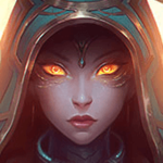
This is my first ever signature. Any critiques?
Looks pretty badass, the only nitpick I have is that the text is too bright as it is. Perhaps add some outline to it to make it stand out more?