


1st (3pts): Apfel: :D Your sig is really nice. Only think I would suggest is to increase the contrast a bit, as it looks a bit bright and flat.
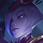
2nd (2pts): MissMaw: Really like this sig, think the render fits the background really well! However, there is some weird sharpening on her left (our right) shoulder, could've been on purpose, but I don't really like that part.
3rd (1pts): Llama: Honestly, really close call between this and MissMaw, but the thing that put you a bit behind was how the blue sparkles don't really fit the red background. I know it's a small thing, but this made me feel like it didn't fit with the background and that was iffy for me. Still an amazing sig regardless.
Pwnzor1130
<Member>
<Member>

1. The_Nameless_Bard - The sig is simple and elegant and I like it!
2. fashionablellama - The render is quite nice and I like the overall theme of the sig. Good job!
3. MissMaw - I'd like it much more if it weren't for Samus. Parts of her seem incredibly oversaturated and others seem rather dull. Overall, quite a nice attempt.
Also, Nameless would like to let you guys know that she won't have internet for a while. It seems like a tree has cut out their cable.
Thanks to The Nameless Bard and Vavena for the sigs!


Two more days of voting, guys :D
ROUND TWO
ENTRIES

|
VOTING OPEN
|
Voting Rules: + Use the template provided (ie, give feedback) - this means that you vote 1st, 2nd and 3rd. + If you participated in the round, you have to vote. + If you do not vote, you lose your points, effectively disqualifying yourself from the round. + As per before, you receive 1 participation mark per round by voting. + You can vote if you did not participate in the round. + As a reminder, The_Nameless_Bard currently holds the most points! |
ROUND TWO
|
R3 End: 02/10/13 Vote Start: 03/10/13 Vote End: 07/10/13 R4 Start: 08/10/13 RULES 1) Don't vote for me. 2) Use stimulus provided. 3) Use correct dimensions. 4) Participants must vote. 5) Use voting template. 6) glhf! |
 VOTING TEMPLATE VOTING TEMPLATE |
jhoijhoi wrote:
This is my example of what can be done with the stimulus:
|
ENTRIES
mastrer1000 wrote:
The_Nameless_Bard wrote:
Apfeljack wrote:
Quoted:
XeresAce wrote:
fashionablellama wrote:
Bludes wrote:
-NA- Veng Lmfao wrote:
DR34MK1LL3R wrote:
Hogopogo wrote:
YayaFTW wrote:
Test0ML wrote:
Kinen wrote:
leipetaco wrote:
Thatdudeinthecotton wrote:
Before I vote, I'd like to say it's nothing personal :O
1. Apfeljack - Really like the unique style, never seen anything like it! Sparkles give it a nice touch, and the text is done creatively!
2. fashionablellama - It was hard to choose between yours and Apfeljack's, really like the splatters and placement of the character, but the text is a bit small.
3. The_Nameless_Bard - Nice lighting and sparkles make Miss Fortune pop, but I feel if a different color theme was used or placement was different it could have gone better.
Click above to check out my blog, it's full of art and the latest League news!


1st (3 Pts) Apfeljack - Everything fits.Good job!
2nd (2 Pts) YayaFTW - I really like the signature too bad I can't give you 3 points aswell,the only difference between you and applejack is the style.
3rd (1 Pt) XeresAce - I love the signature you made,too bad the text ruined but I can't say why because I don't know too much about text(I am still learning how to do a good text and where to place it) I just don't like where it is and how it looks.
Voting ends todaaaay :) So get your votes in!
Here's my constructive criticism:
> mastrer: I liked your idea a lot. I'm not sure why there is a faint white pixlated outline around the letters, but that can normally be removed with an inside stroke of 1px. I'd also center the text, as right now it's off to the left.
> Amanda: I really actually didn't like this one. The colours seemed over saturated, the text squished to the side and a lot of blank space on the left.
> Apfel: I like the composition, but felt the colour was a bit washed out?
> Maw: Love the text, not sure about the placement. The render also seems to be too far to the left. But I liked the sig.
> Xeres: I don't like the text, it looks really blurry.
> llama: I absolutely love yours. I'm not sure about the text, as it looks really sharpened, but that was probably the intention. The whole sig is so crisp and clean.
> Bludes: I liked the idea, but I think the execution was lacking. It would have looked more uniform if you had used Impact as the actual font and applied a clipping mask over the top of the smaller letters. If that makes sense?
> Veng: Not quite sure what to think about your sig. It's bright and lively, but the text is awkward to me.
> Dream: The text placement and effects on it look really odd. I don't think Amanda's lines suit this sig, because of the background. The lines make it just look like... you know how when you take a photo of a computer screen? That sort of distortion.
> Hogo: Really like blurred effects you've used here. I think the text may be a bit too close to the center, but I like the overall signature.
> Yaya: I think the text could have been closer together and I dont like the pink glowing fractal on her arm. But like the overall image :)
> Test: I don't like the lines in this one, or the text. The smudging is goof though!
> Kinen: Like I said before, amazing progress made. I don't like the fractal on her hand because of the grainy texture you put over the top. Also, the text could have been placed closer together. But great use of composition :)
> Cotton: I don't like either text placement, but like the words you chose. I could see them being used with that image. The sig is also very hevily saturated, I think adding a gradient and setting it to soft and a low opacity would have added depth to the colours. Good attempt!
MY VOTE
1st (3 Pts): fashionablellama - I really enjoy looking at your piece. Please see feedback above :)
2nd (2 Pts): Kinen - You've shown the most improvement during this competition. I can't wait to see what you come up with next!
3rd (1 Pt): Bludes - You have also shown remarkable improvement during this competition. Well done :)
CURRENT POINTS
Apfeljack: 3 + 3 + 1 + 3 + 3 + 3 + 3 + 3 + 2 + 3 + 3 + 3 + 3 + 3
Llama: 2 + 2 + 3 + 2 + 2 + 2 + 2 + 3 + 1 + 2 + 2 + 1 + 3
Bard: 1 + 2 + 1 + 3 + 1
Yaya: 3 + 1 + 2 + 1 + 2 + 2
MissMaw: 2 + 1 + 2 + 1 + 2 + 1 + 2
leiptaco: 1
hogo: 2 + 3 + 1 + 1 + 1
Kinen: 3 + 1 + 2
Bludes: 1 + 1
Xeres: 1
Wow Apfel, you've blown everyone out of the water, almost always scoring 1st place, excellent work! :P

You need to log in before commenting.
1) 3P - Apfeljack
Absolute fit for Vi, the background is cleverly paced and render is excellent. I might have gone for a bit stronger colors instead - to see if it makes the text and Vi stand out/pop out of the image. Overall, a masterpiece.
2) 2P - YayaFTW
I liked the text, the color treatment along with the brightness, while high, fits the theme. I am torn whether I like the horizontal lines or not. In my opinion, they help focus the most important aspect of the pic.
3) 1P - MissMaw
This was a real toughie. But I am Metroid -biased (I have the Trilogy edition) and this picture's background and fractals create a wonderful atmosphere around good old Samus. The rd part under her right armpit confuses me a little though.
Cheers.