


|
|
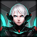
Test: I like everything but the left hand side which looks like it has too much going on. Dream: I like Riven's colour scheme, I think it's really crisp and clean. I think maybe you could have done something in the background, but as the requester really didn't want much done, I think you did as much as you could without adding too much. If that makes sense :P Tried out this tutorial: http://kyantsu.deviantart.com/art/Tutorial-2-Black-Rock-Shooter-399863802 > I quite liked the overall look at the end. Would probably do things differently if I tried it again. |


i'd try something like the "border" nameless made in your sig, so a complatly black layer(low opacity obviously) below your render that leaves some space at the top and the bottom.
edit: fk, you have a randomizer. i mean the leblanc one, the text is "would i lie" iirc.
edit: fk, you have a randomizer. i mean the leblanc one, the text is "would i lie" iirc.


You need to log in before commenting.
p.s. he wanted no resize and no text, just a border and some effects